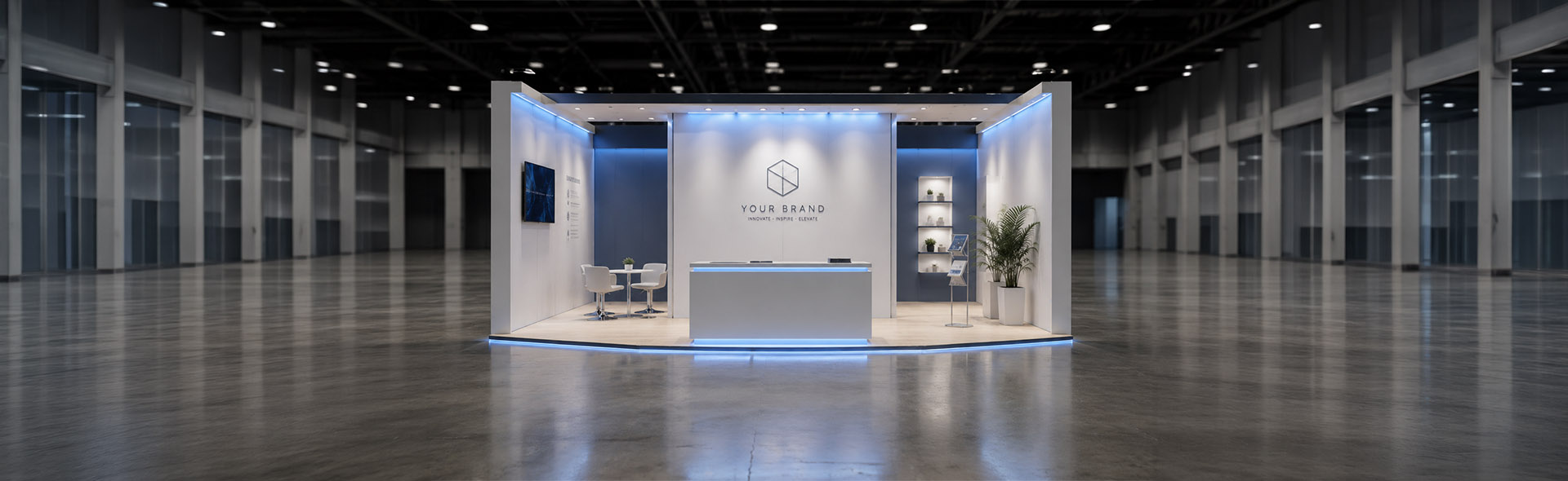
Fair Booth and Exhibition Design Projects
A selection of exhibition booth projects — each one designed to present a client's product or service clearly and compellingly in a trade fair environment. Fair booths are a particular discipline: the design has to work from a distance, communicate within seconds, and hold its quality across large-format print. The focus across all of these projects was on visual clarity, confident use of brand, and removing everything that didn't earn its place on the panel.
Recardy & Benefits Manager — Joint Booth
This project brought two clients together on a single booth — Recardy, an employee benefits card platform, and Benefits Manager, an HR and tax consultancy. Both businesses operate in the employee benefits space and share a target audience of HR decision-makers and employers. The brief was to present the collaboration clearly, lead with the shared app interface, and keep the copy sharp and direct. The most important constraint was making a co-branded design feel unified rather than divided.
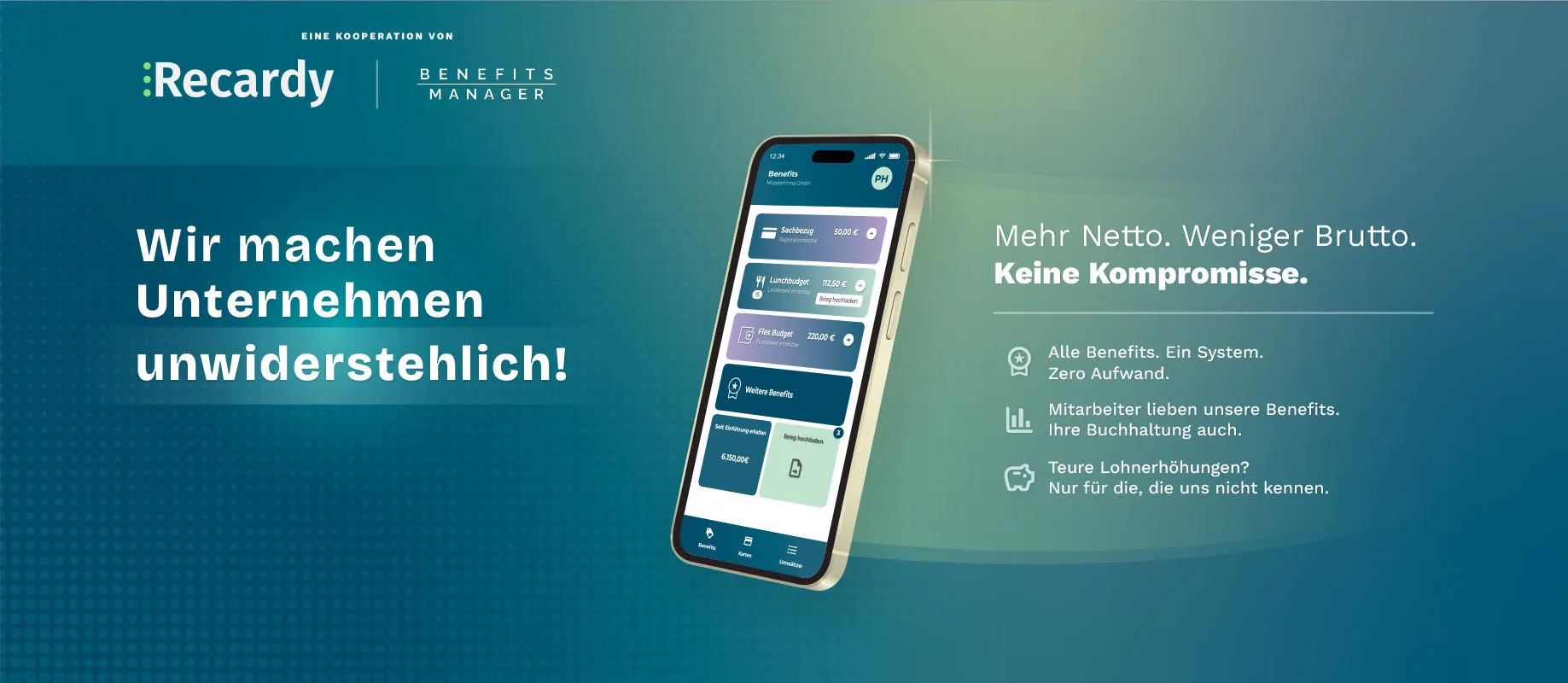
The visual foundation is a deep teal-to-dark-teal gradient, applied consistently across both the backwall and the side roller banner. A subtle dot matrix texture runs across the entire surface, adding depth without competing with the content. Both brand identities appear together in the header — separated by a clean vertical divider — establishing the partnership immediately at eye level, before a visitor reads a single word of copy.
The design works because both brands share a blue-teal colour family. Rather than forcing a visual compromise, the shared gradient background acts as neutral ground — giving each brand equal presence without either one dominating. The co-branding reads as intentional partnership, not an awkward collision of two separate identities.
The backwall headline — "Wir machen Unternehmen unwiderstehlich!" — is positioned to the left at bold display scale, anchoring the entire composition. A centred phone mockup showing the live app interface provides immediate product proof, while a concise three-point benefit list on the right completes the reading flow: bold claim, product evidence, supporting detail. The layout is deliberately balanced across all three zones.
The side roller banner uses "Let's talk Netto!" as a conversation starter — punchy, direct, and specific enough to land with anyone responsible for payroll or employee compensation. The phone app UI is the only graphic element it needs. Against the same teal gradient and dot texture as the backwall, the roller reads as part of the same system rather than a separate supporting piece.
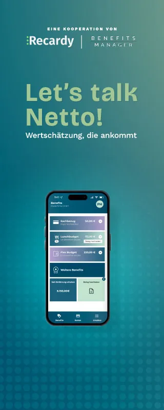
Leading with a German headline built around the word "Netto" was a deliberate editorial choice. It's a concept the target audience thinks about daily — take-home pay, tax-free benefits, net salary optimisation. This wasn't a generic product claim. It was a prompt designed to open a conversation, which is the only goal that matters at a trade fair.
Scope of work
- Co-branded booth concept and layout strategy
- Backwall design — large format, print-ready
- Side roller banner design
- Colour harmonisation across two distinct brand identities
- App UI mockup integration and copy direction
- Print-ready file delivery
Need to Prepare a DTP Project Brief?
Create a structured project brief in your browser before contacting a DTP provider. Add your file format, page count, languages, deliverables, and common production risks. No upload, no storage, no sign-up.
Prepare Project BriefYou can use the generated brief with DTP Services Berlin or any other agency.
Repertus — "Creatively Simple"
Repertus is the company behind JUNUX — a Shopware-based POS and unified commerce system. For their trade fair presence, the brief called for a booth that felt unmistakably premium and technology-forward, presenting both the Repertus brand and the JUNUX product architecture in a single coherent visual environment. The tagline "Creatively Simple" set the tone: the design itself had to embody that — sophisticated in execution, clear in communication.
The backwall is built on a deep dark background with a vivid blue gradient bloom on the left and a rich purple bloom on the right — two colour zones that converge at the centre where the logo sits. This split-gradient technique creates immediate depth and drama, making the panel readable from across a busy exhibition floor. Fine diagonal line texture runs continuously across the entire surface, adding a tactile, technological quality without cluttering the composition.
The subtle diagonal line texture is applied identically across both the backwall and the side roller banner. When viewed together, the booth reads as a single designed environment rather than two separate print pieces — a detail that matters significantly on the floor of a trade fair, where the eye moves across the entire space before it settles on individual elements.
The main panel makes a bold creative choice: just the logo, centred, on the gradient. No headlines, no bullet points, no product screenshots. The Repertus wordmark — with its distinctive metallic lettering and the tagline "Creatively Simple" beneath it — is treated as the sole visual statement. In an exhibition environment full of competing claims and dense information panels, a booth that shows only its name commands a different kind of attention. It invites curiosity rather than demanding a read.
The side roller carries all the product content, keeping the main wall clear. The JUNUX system architecture is presented as a node diagram mapping six unified commerce touchpoints — Online-Shop, Point-of-Sale, Smart-Mirror, Self-Checkout, Assistant-App, and Touch-Point — all connected at a central intersection point. The headline "JUNUX — Unifying Commerce" frames the diagram immediately, with a supporting paragraph in German explaining the core proposition to visitors who stop to engage. The same dark gradient and line texture runs behind it, keeping the roller visually bonded to the backwall.
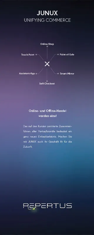
Moving all product detail from the backwall to the roller creates a deliberate visitor flow. The main wall stops people — it works at distance and relies entirely on brand presence. The roller gives them something to read once they've already stopped. These are two separate functions, and keeping them on separate surfaces makes both work better.
Scope of work
- Booth concept and spatial content strategy
- Backwall design — large format, split blue-purple gradient system
- Side roller banner — JUNUX system diagram and product copy
- Continuous diagonal line-work texture across all surfaces
- Metallic logo treatment for Repertus wordmark
- Print-ready file delivery
Recardy — Benefits Card Platform
For their standalone fair booth, Recardy needed a design that communicated something harder to achieve than technical credibility: warmth. The platform is a Mastercard-based benefits card system that gives employees tax-free purchasing power across food, shopping, and everyday spending. The people using it are employees, not systems administrators. The design needed to put people at the centre — literally and figuratively.
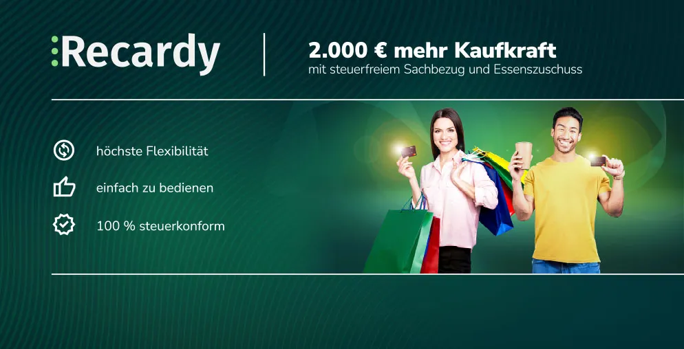
The main backwall leads with people — two individuals holding Recardy cards and shopping bags, photographed against a rich dark green background. A warm lens flare blooms from behind them, creating a natural light halo that draws the eye toward the centre of the composition. The effect is inviting rather than corporate. Green-on-green tonal depth gives the panel a premium finish that reads as designed, not assembled from stock.
Using real people in fair booth design is a deliberate choice that carries risk — generic photography can undermine a brand instantly. Here the figures are integrated into the composition rather than dropped on top of it. The lens flare creates a natural bridge between the subjects and the background, and the wavy pattern texture behind them adds a subtle sense of movement. The result reads as a designed scene, not a photo placement.
The headline "2.000 € mehr Kaufkraft" does exactly what fair booth copy should do: it states the benefit in concrete, immediate terms. Three supporting bullet points — höchste Flexibilität, einfach zu bedienen, 100% steuerkonform — address the practical questions an HR manager or employer would ask next. A clean horizontal rule structure separates the headline zone from the supporting copy, maintaining a clear reading hierarchy even at a glance from several metres away.
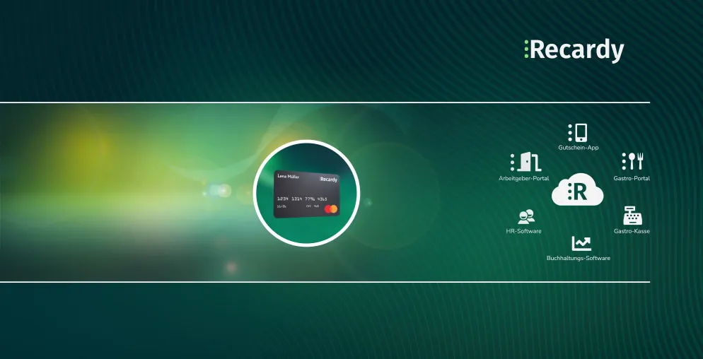
The second panel shifts register — from human warmth to product architecture. The Recardy Mastercard sits at the centre of a circular ecosystem diagram showing six integration points: Gutschein-App, Arbeitgeber-Portal, Gastro-Portal, HR-Software, Gastro-Kasse, and Buchhaltungs-Software. A green-yellow light bloom on the left side of the panel creates visual depth and continuity with the main wall, while the integration diagram on the right is laid out with enough breathing room to read clearly in print.
The two panels tell a complete story in sequence. The first answers "why would my employees want this?" with aspiration and human benefit. The second answers "how does it actually work?" with the product ecosystem. Together they address both the emotional and the rational side of the purchasing decision — which reflects exactly how decisions are made by employers evaluating benefits solutions at a trade fair.
Scope of work
- Two-panel booth concept and narrative structure
- Main backwall — human photography integration and light effects
- Dark green gradient system with lens flare and texture treatment
- Copy direction and benefit hierarchy
- Product ecosystem diagram — card and integration layout
- Print-ready file delivery
DICOMATICS — Data Solutions for Medical Imaging
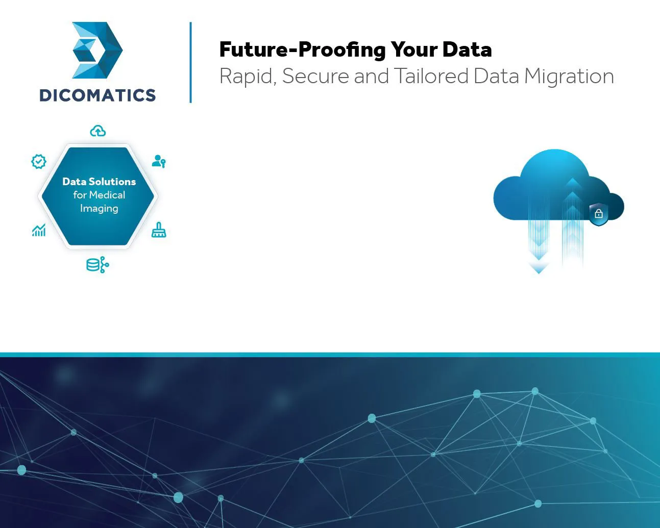
DICOMATICS provides data migration services for medical imaging — a highly specialised, technically demanding field where trust, security, and precision are the primary purchase criteria. The brief called for a clean, professional booth that drew on elements from their existing website and visual language, presented their service clearly through diagrammatic content, and incorporated a cloud system illustration as the centrepiece of the product explanation.
The backwall design is structured across two clearly distinct horizontal zones. The upper zone uses a clean, near-white background — giving the brand mark, tagline, and technical diagrams maximum legibility against a neutral ground. The lower third transitions to a deep navy blue filled with a geometric polygon network: interconnected nodes and lines that communicate data infrastructure, connectivity, and precision without relying on cliché tech imagery.
Splitting the backwall into a light upper zone and a dark lower zone solves two problems at once. The light area gives the content — logo, headline, and diagrams — a clean background for maximum legibility at distance. The dark lower section adds visual weight and atmosphere, making the panel feel substantial rather than sparse. The transition between them reads as a designed horizon line, not an afterthought.
The logo sits top-left alongside the tagline "Future-Proofing Your Data" and the subtitle "Rapid, Secure and Tailored Data Migration" — establishing both the brand and the core proposition within the first reading zone. A vertical rule separates the identity area from the headline, a clean structural detail borrowed directly from the DICOMATICS website and adapted for large-format print.
The left side of the content area carries a hexagonal diagram labelled "Data Solutions for Medical Imaging", surrounded by six service icons representing individual capabilities. The hexagonal form references both data architecture and the structured precision of medical imaging workflows. On the right, a three-dimensional cloud illustration shows data streaming upward into cloud infrastructure with a security lock — communicating the migration process clearly in a single image: data moves securely, at speed, to the cloud.
Medical data migration is inherently difficult to communicate visually — the process is invisible, the stakes are high, and the audience is sceptical of oversimplification. The cloud diagram manages this precisely: it conveys "your data moves securely to the cloud" in a single illustration, without reducing a complex technical process to something unconvincing. The hexagonal service diagram handles the "what specifically" question for visitors who want more detail.
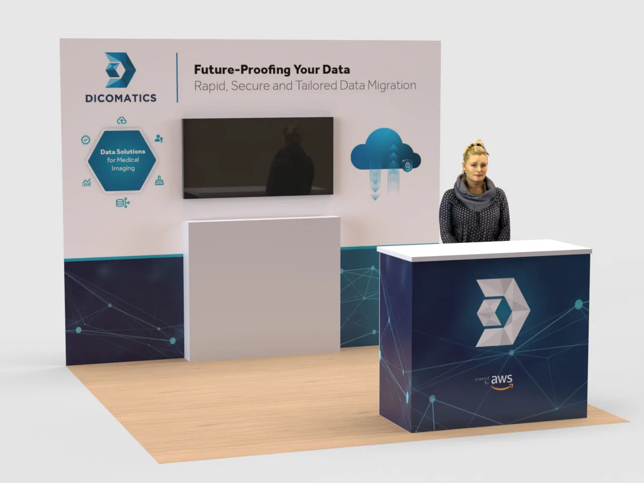
The counter unit extends the booth's visual system by wrapping the same dark navy polygon network across its front face, with the DICOMATICS icon mark enlarged and centred alongside the AWS partnership badge. This continuity between backwall and counter means the entire booth reads as one environment — a detail that reinforces the brand's message of technical coherence and reliability.
Scope of work
- Booth concept and two-zone layout strategy
- Backwall design — large format, light upper and dark lower zone system
- Hexagonal service diagram — Data Solutions for Medical Imaging
- Cloud migration illustration integration
- Counter unit design — dark polygon network with logo mark treatment
- AWS partnership badge placement and branding compliance
- 3D booth visualisation for client approval
- Print-ready and screen-ready file delivery
Need a fair booth designed?
From concept and copy through to print-ready artwork — booth design that works at distance, communicates in seconds, and holds its quality across large-format print.
Get in touch →