
Magazine, Flyer and Brochure Design Projects
Magazines, brochures, and flyers — designed for print
Print design is where layout precision matters most. A well-designed brochure, company magazine, or sales flyer communicates professionalism before a single word is read. Every project is designed in Adobe InDesign and delivered as a complete, print-ready package — with bleed, crop marks, embedded fonts, and colour profiles set correctly for the press.
The output format is always a press-ready PDF, packaged with all linked images and fonts — ready to hand directly to any print shop or commercial printer, anywhere.
Multi-page editorial layouts with consistent grid systems, running headers, image-text balance, and chapter structure. Designed for commercial printing in saddle-stitch or perfect-bound formats.
Sales brochures, product folders, and company presentations — bi-fold, tri-fold, or multi-page. Clear visual hierarchy, on-brand typography, and print-safe colour handling throughout.
Single-page promotional materials with a single strong message. Designed for maximum impact in minimum space — A4, A5, DL, or custom formats, front and back.
Recardy, Repertus & JUNUX — Magazine & Catalogue Design
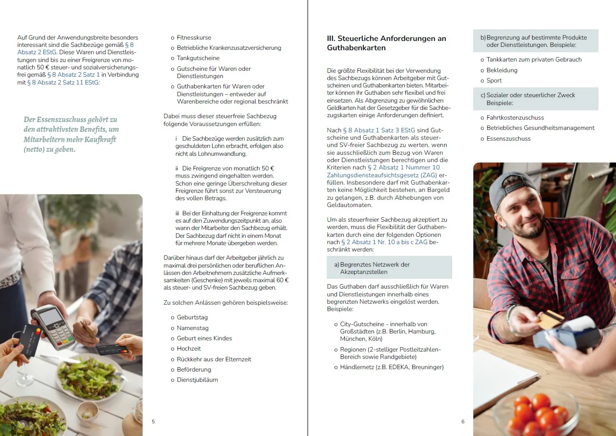
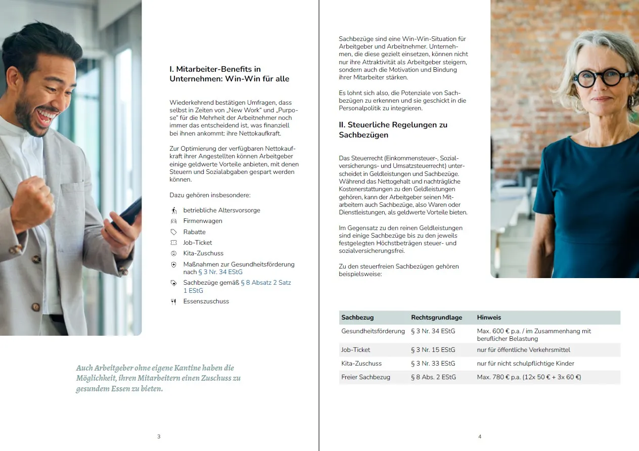
A full company magazine for Recardy, the Berlin-based employee benefits fintech. The publication covers the Recardy product range, benefit compliance guidance, and employer-facing content — designed as a professional leave-behind for B2B sales conversations and HR decision-makers.
Magazine and catalogue covers — three distinct brand identities, each adapted to print format
Designing for the double-page spread
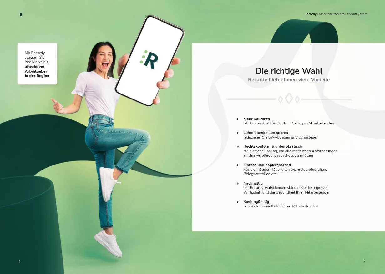
A magazine is read in spreads, not single pages — so every layout decision must work across the gutter. Image placement, pull quotes, and content blocks are designed to create visual flow from left page to right, drawing the reader forward. The Recardy magazine uses a clean two-column grid with full-bleed photography on the right-hand page to maintain energy across the publication.
Interior spreads — from data-heavy legal content to visual benefits overviews, consistent grid throughout
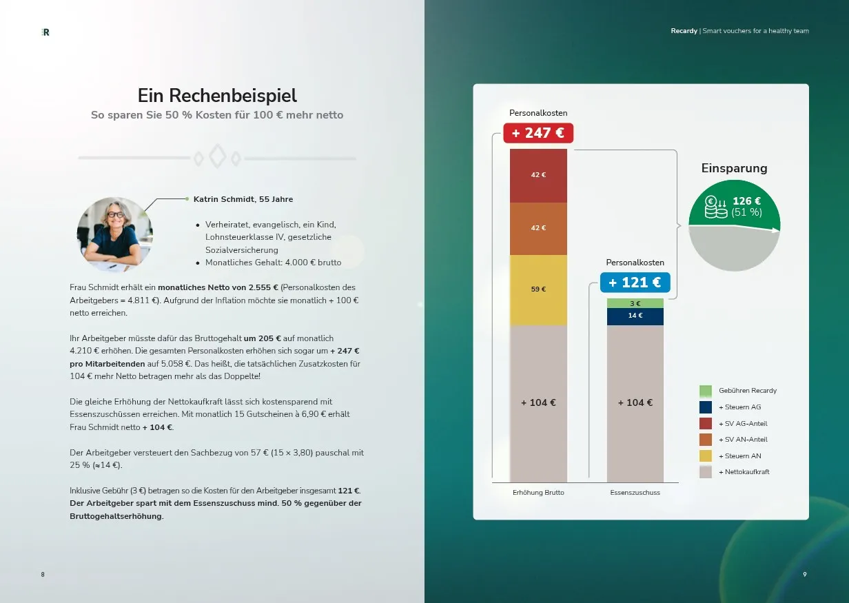
Several spreads combine dense legal and financial content — tax references, cost comparisons, calculation examples — with infographics and photography. The challenge is keeping this readable and visually approachable without oversimplifying. Column structure, pull quotes, and sidebar treatments separate content layers and give the reader clear entry points into complex material.
Need to Prepare a DTP Project Brief?
Create a structured project brief in your browser before contacting a DTP provider. Add your file format, page count, languages, deliverables, and common production risks. No upload, no storage, no sign-up.
Prepare Project BriefYou can use the generated brief with DTP Services Berlin or any other agency.
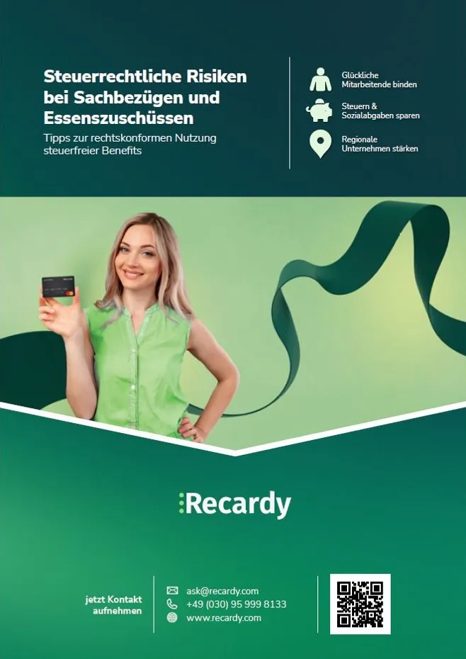
Recardy — Sales Flyer & Product Brochure
Alongside the company magazine, the Recardy print suite includes a single-page sales flyer and a detailed product brochure — each serving a different point in the sales funnel. The flyer is a fast, punchy awareness piece. The brochure goes deeper, walking HR managers through the product offer with comparison data and a concrete cost calculation example.

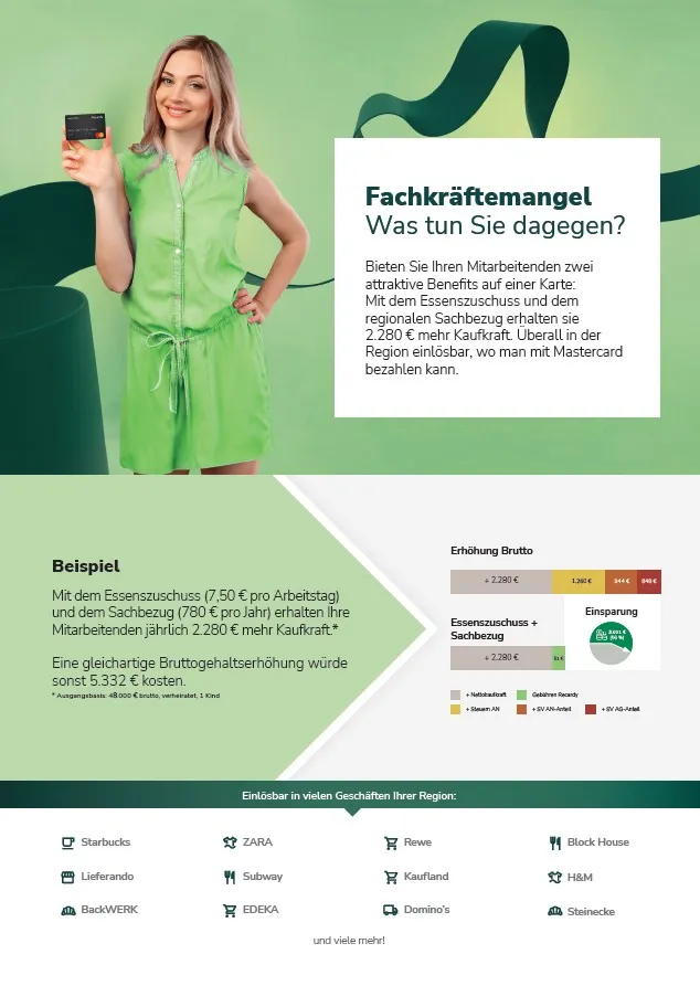
Left: A5 sales flyer — single message, one clear CTA. Right: Product brochure interior with cost comparison infographic
One page. One message. One action.
A flyer has seconds to make its case. The Recardy meal subsidy flyer leads with a direct question the target audience is already asking — then answers it immediately with a clear benefit and a single call to action. Full-bleed photography, a strong headline, and a minimal content block keep the layout uncluttered and the message unmissable. Delivered as a print-ready A5 PDF, bleed included.
Benefits Manager — Sales Brochure
A B2B sales brochure for the Benefits Manager platform — designed to be handed to HR managers and company decision-makers. The brochure presents the full product benefit offer in a structured, visually clear format, combining app mockups with product descriptions and benefit-by-benefit breakdowns.
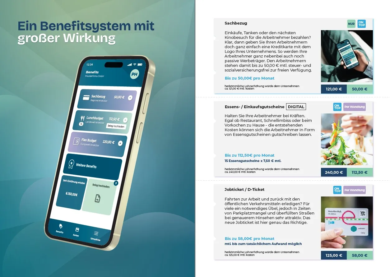
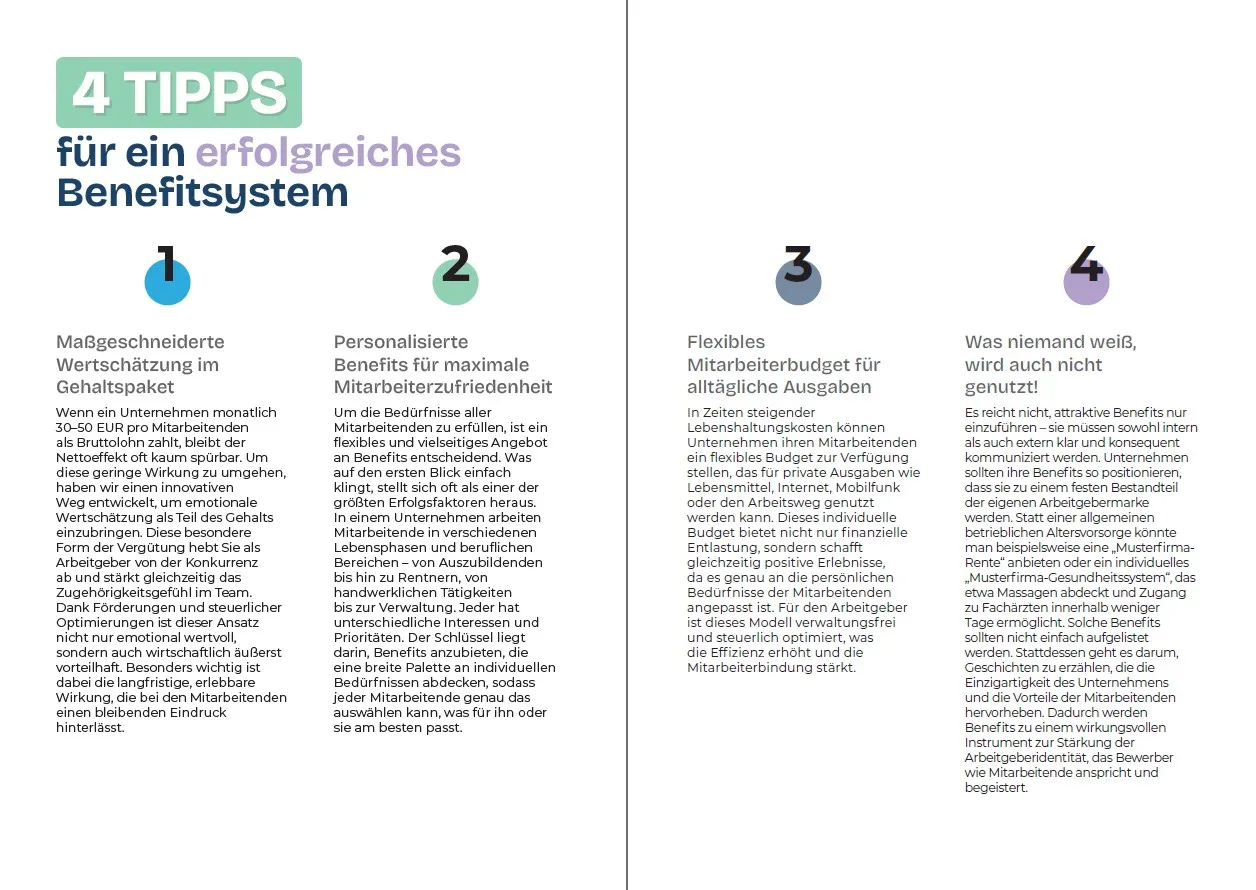
Left: product overview spread with app mockup. Right: editorial tips spread with four-column layout
The Benefits Manager brochure uses a modular grid that switches between a two-column product layout and a four-column editorial layout — giving the publication visual variety while maintaining structural consistency. App screen mockups are integrated into the layout as design elements, not afterthoughts, anchoring the reader to the actual product experience.
- Multi-page brochure layout in Adobe InDesign
- App screen integration as editorial design elements
- Benefit-by-benefit product breakdown with pricing data
- Four-column tips spread with numbered editorial structure
- On-brand typography and colour system throughout
- Press-ready PDF export — CMYK, bleed, embedded fonts
JUNUX — Product Magazine Interior
Editorial interior layout for the JUNUX product magazine — a publication explaining the unified commerce POS system to retail business owners. The spread shown covers the central inventory management feature, using a clean light-background layout with full-bleed right-page photography and a well-structured text hierarchy.
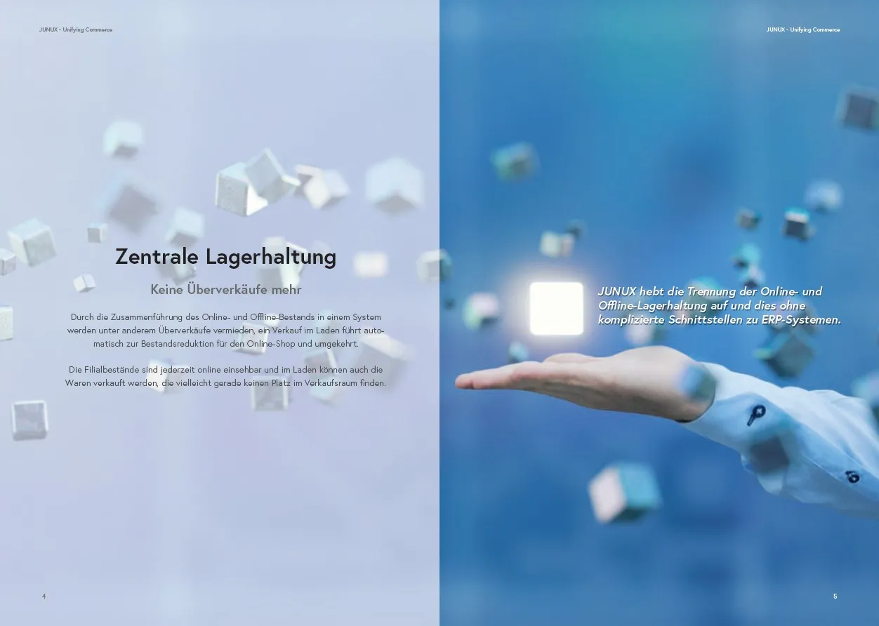
Interior spread — text-image balance across the gutter, pull quote on the right page
Hierarchy that guides the reader through complex content
Technical product content needs clear typographic hierarchy: a strong headline, a benefit-focused subheading, then body text that explains the detail. The JUNUX spread uses three type levels — display headline, italic subheading, and two body paragraphs — to let the reader choose their depth of engagement. The pull quote on the right page functions as a standalone message for those who skim. Everything is set with language-correct German hyphenation and paragraph spacing calibrated for comfortable long-form reading in print.
What the print design service includes
Every print project is handled from first layout to final delivery — no partial handoffs, no files that need fixing at the print shop.
- Layout design in Adobe InDesign — from single-page flyers to 40+ page magazines
- Custom grid system and typographic hierarchy per project
- CMYK colour management throughout — no RGB-to-CMYK surprises at the printer
- Image placement, retouching coordination, and resolution checks (min. 300 dpi)
- Bleed, slug, and crop mark setup to print platform specifications
- Font embedding and preflight check before delivery
- Press-ready PDF/X-1a or PDF/X-4 export — compatible with all commercial printers
- Full InDesign package delivery — links, fonts, and document included
- Formats: A4, A5, DL, square, custom — single-sided, double-sided, folded
- Binding formats: saddle-stitch, perfect-bound, spiral — correctly set up for the press
Other DTP project areas
Have a print design project?
Magazines, brochures, flyers, and catalogues — designed in InDesign and delivered print-ready.
Get in touch →