Logo Design Projects
A selection of logo and brand identity projects — each one built around a specific business idea, audience, and visual language. Every mark shown here started with a brief, went through concept and refinement, and was delivered as a complete, production-ready identity. The focus throughout is on clarity, distinctiveness, and long-term usability across print and digital formats.
Benefits Manager
Benefits Manager is a service platform that brings together employee benefits management and tax consultancy under one roof — a combination that required a logo capable of communicating both professionalism and accessibility. The brief called for a mark that felt trustworthy and structured, without being cold or overly corporate.

The final mark balances geometric precision with a sense of warmth — reflecting a service that handles complex financial and HR matters on behalf of employees, while remaining approachable in tone. The logotype was chosen to reinforce reliability, with clean letterforms and considered spacing that hold up equally well on screen and in print.
The challenge was finding a visual language that bridges two distinct worlds — employee benefits, which tend toward the friendly and human, and tax consultancy, which demands authority and precision. The result is a mark that sits comfortably in both.
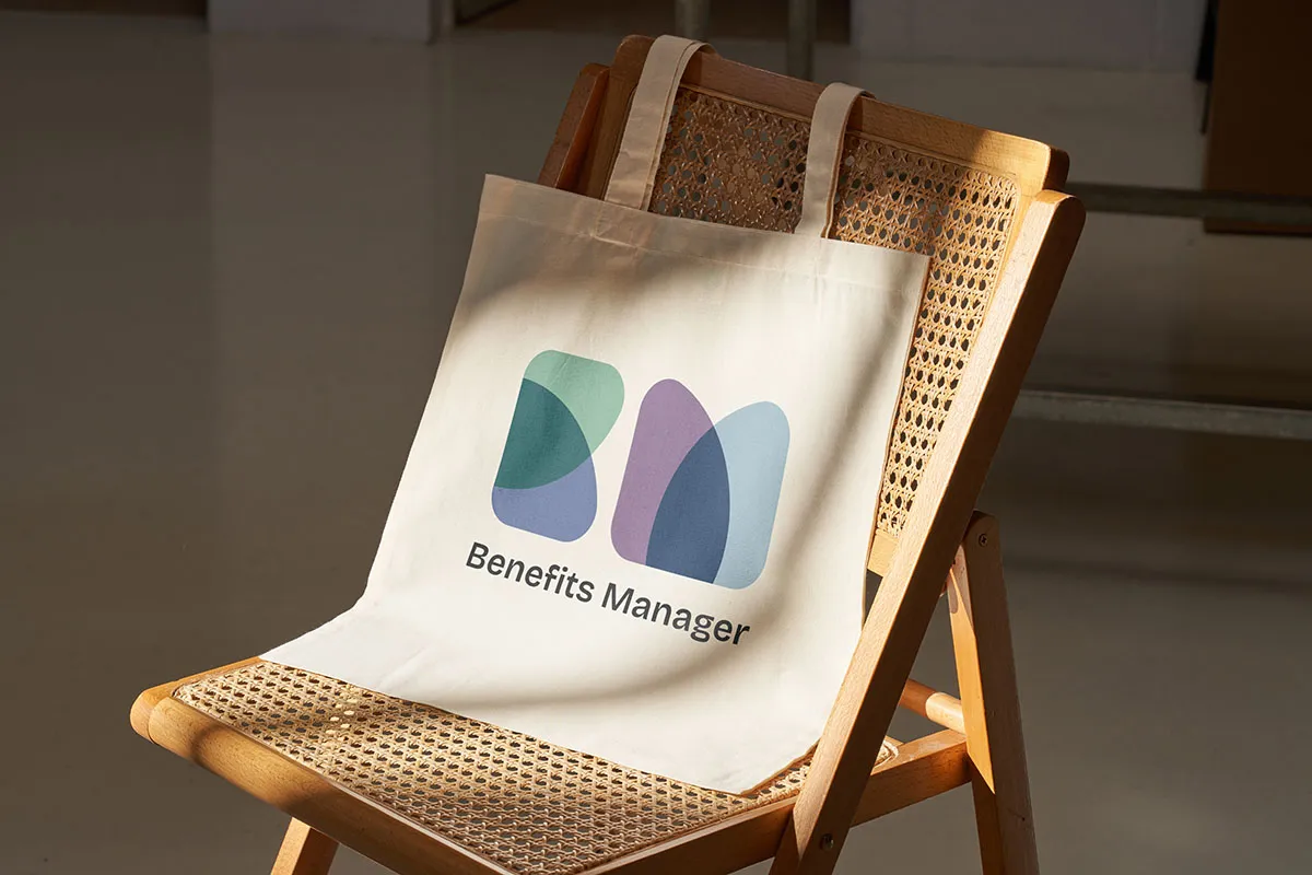
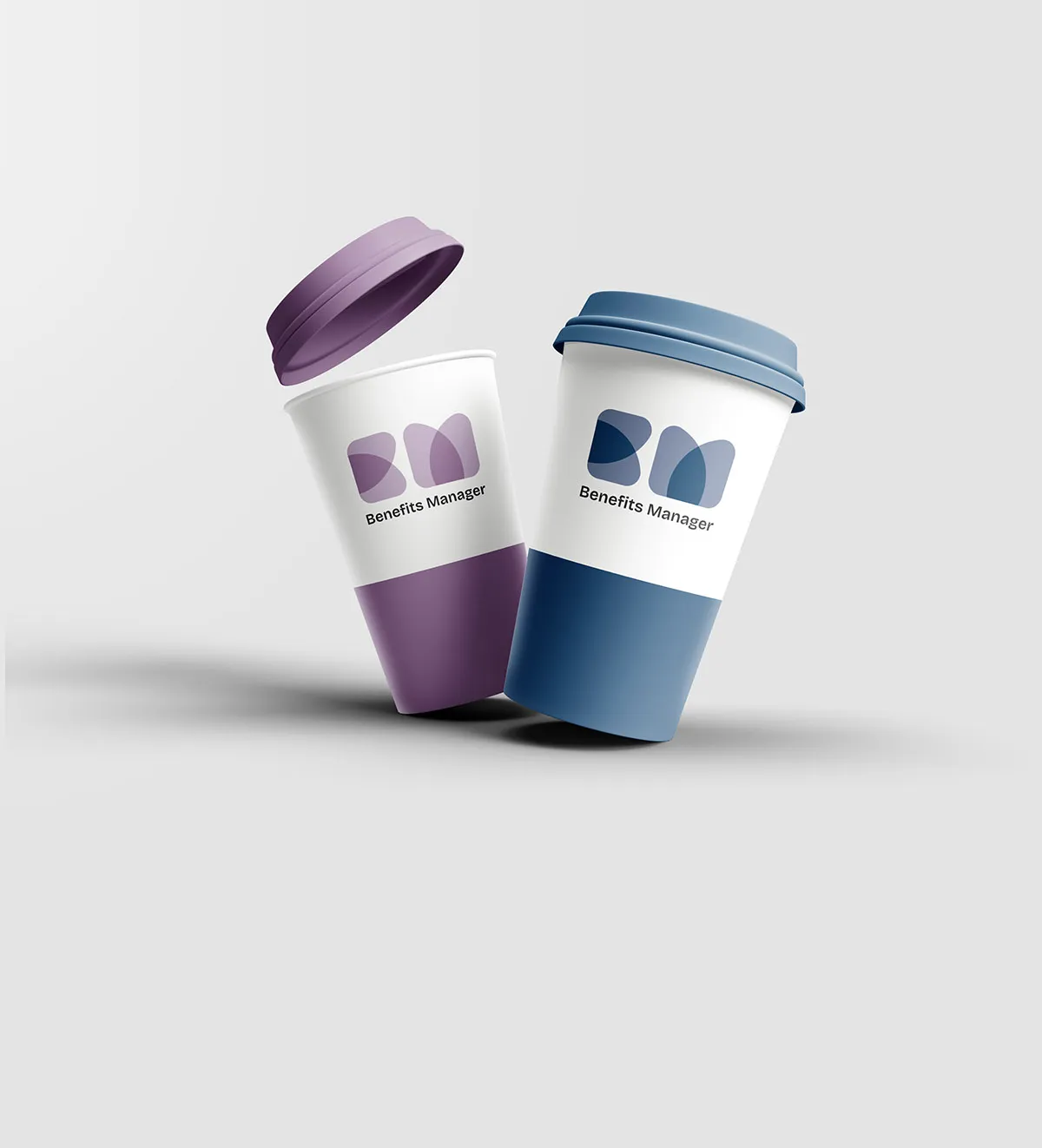
Beyond the core logo, the identity was extended into branded materials to test its real-world presence. Seeing a mark on a tote bag or a paper cup reveals whether it truly works — whether it holds its weight at small sizes, reads well in isolation, and carries meaning without the support of surrounding context.
Scope of work
- Logo concept and development
- Logotype and mark refinement
- Colour palette and typography selection
- Brand application mockups
- Delivery in print and digital formats (SVG, PNG, PDF)
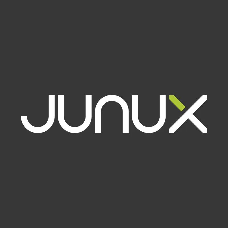
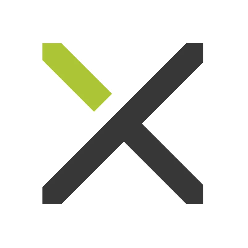
JUNUX
JUNUX is a Shopware-based POS system built around the idea of unifying commerce — bringing online and offline retail into a single, seamless operation. The system runs on iPad and integrates directly with a retailer's existing Shopware online shop, meaning a sale made in-store updates inventory and order records in real time, just like an online transaction would.
The logo brief called for a mark that communicated this sense of unification and precision — something that could represent a modern, technically sophisticated product without feeling cold or overly technical. The name JUNUX has a strong, distinctive sound, and the mark needed to match that energy: confident, clean, and immediately recognisable.
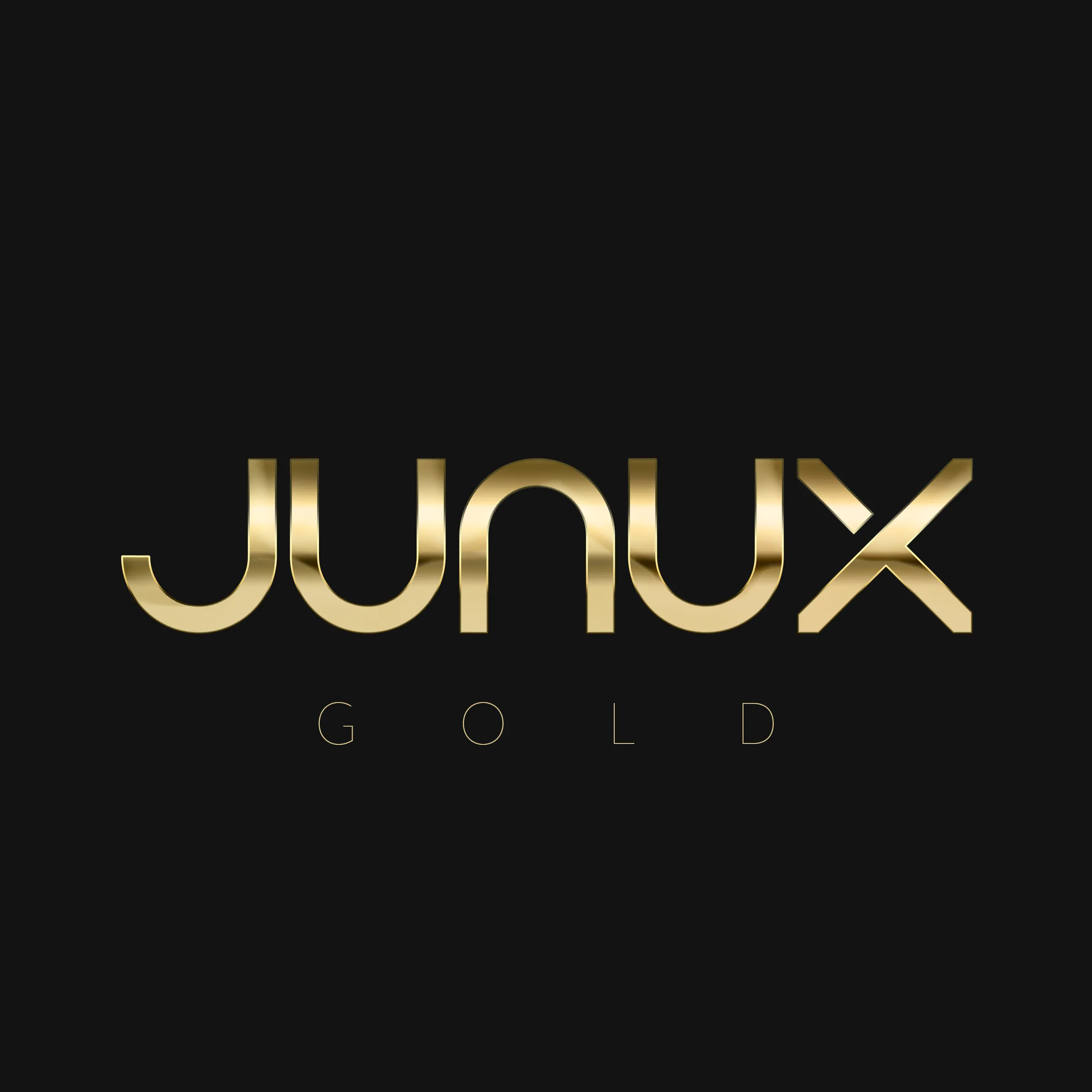
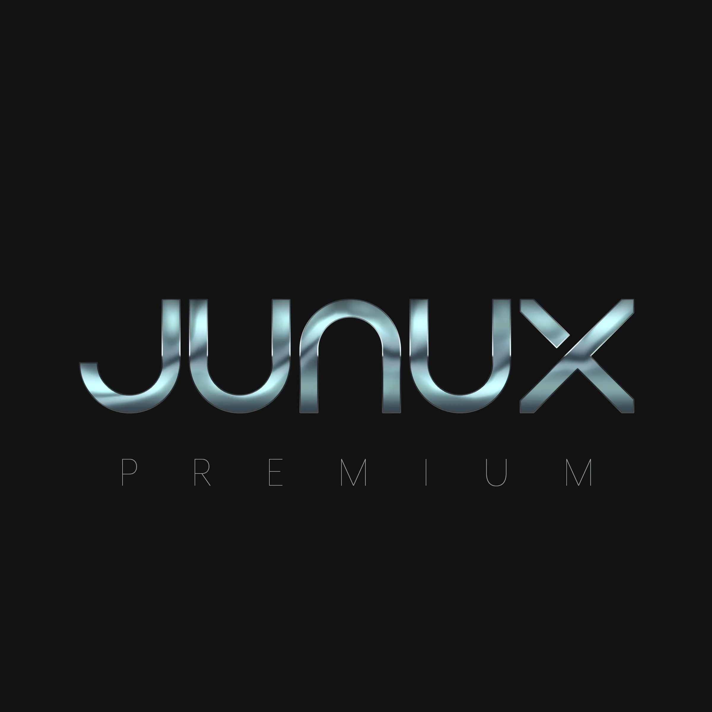
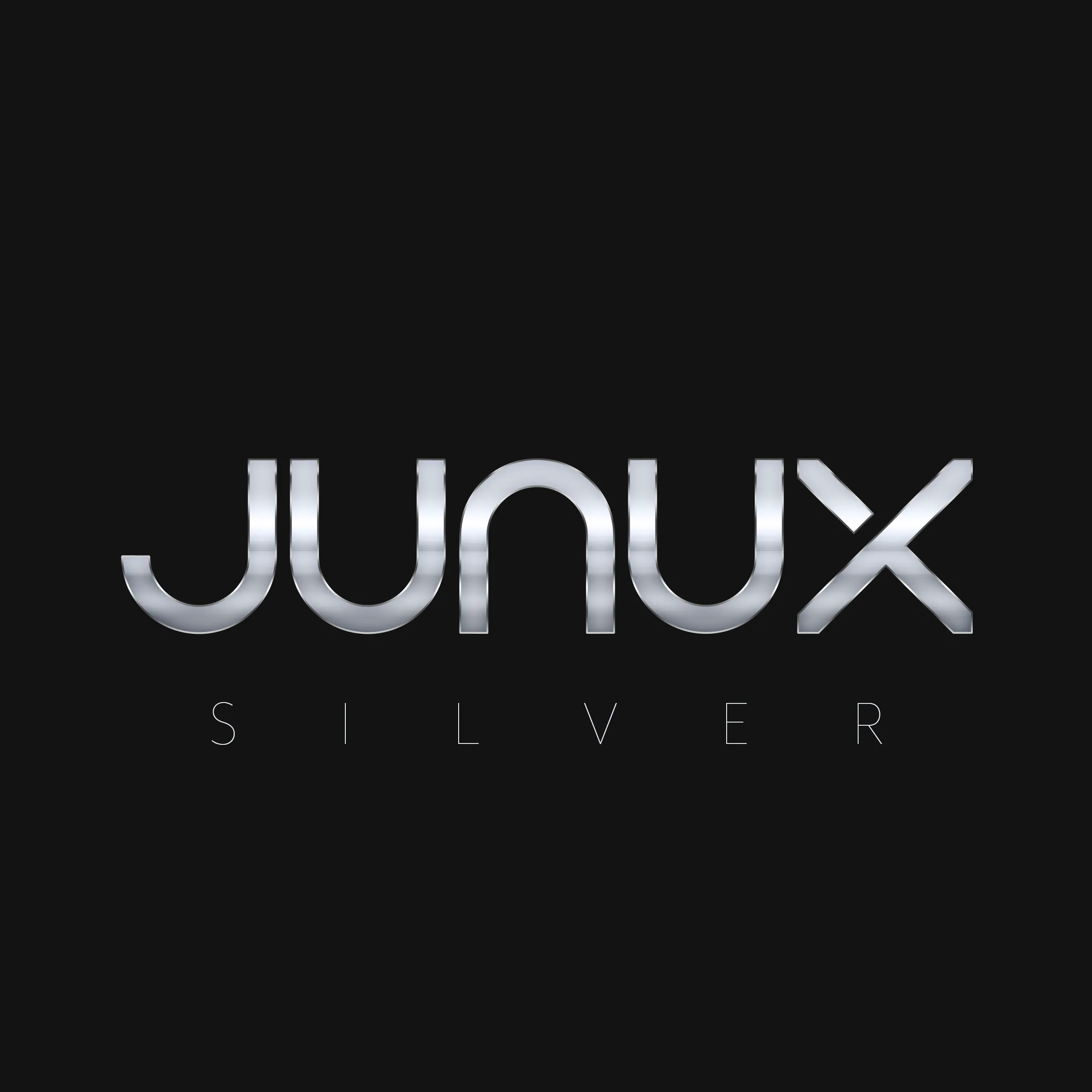
The client required distinct visual identities for three product tiers — Gold, Premium, and Silver — each needing to feel premium in its own right while clearly sitting within the same brand family. The solution was a consistent mark adapted through colour and finish, creating a coherent hierarchy without fracturing the identity.
Each tier was developed with its own colour treatment, allowing partners and customers to immediately understand the level of service or product they were working with. Gold communicates prestige and top-tier value. Premium sits at the core of the offering — the most versatile and widely used variant. Silver provides an accessible entry point without compromising on brand quality.
The three-tier system also gave the client a scalable framework — new tiers or product lines could be introduced in the future using the same logic, keeping the brand coherent as the product evolves.
Scope of work
- Logo concept and mark development
- Three-tier brand variant system (Gold, Premium, Silver)
- Colour strategy and finish differentiation per tier
- Scalability review across sizes and contexts
- Delivery in print and digital formats (SVG, PNG, PDF)
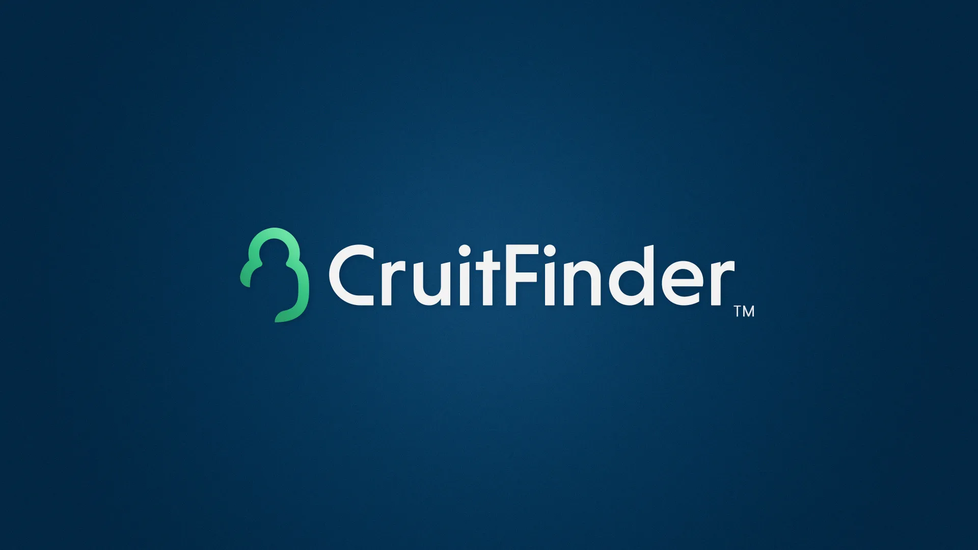
CruitFinder
CruitFinder is a recruitment platform built to connect recruiters with candidates across a wide range of professional sectors. The platform needed a visual identity that communicated speed, clarity, and reliability — qualities that matter deeply to recruiters who depend on finding the right match quickly and confidently.
The name itself — a contraction of "recruit" and "finder" — already had momentum and purpose built into it. The logo needed to reflect that: a mark with direction, with a sense of searching and arriving. The design avoids the clichés common in recruitment branding (handshakes, people silhouettes, arrows pointing upward) in favour of something more ownable and typographically driven.
The mark was developed to feel modern and sector-neutral — suitable for recruitment across industries from technology and finance to logistics and healthcare. A logo that works for one sector without alienating another is a mark that can grow with the platform.
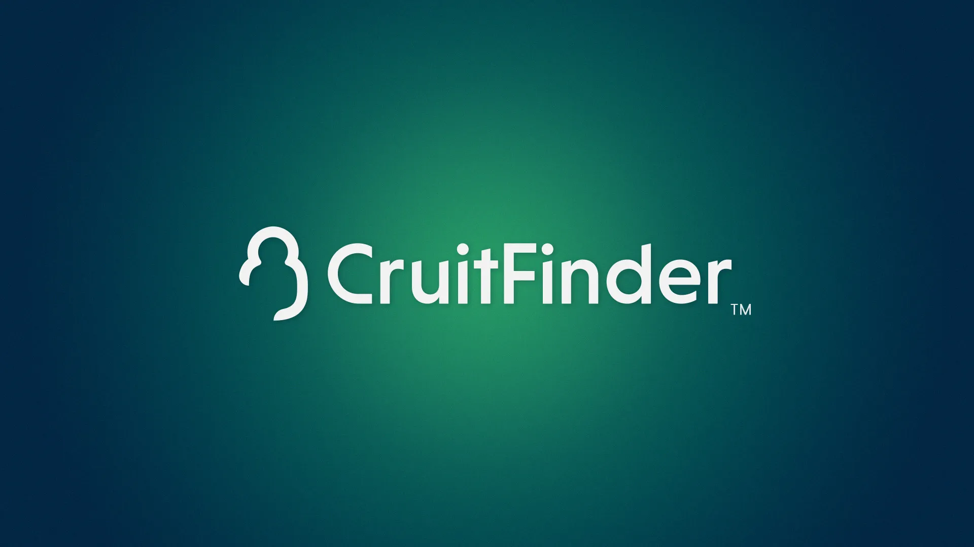
The logo was tested across light and dark backgrounds to ensure it held its integrity in all contexts — from platform UI and app icons to printed materials and email headers. A recruitment platform lives across many touchpoints, and the mark needed to perform consistently across all of them.
Scope of work
- Logo concept and brand mark development
- Light and dark background variants
- Typography and colour palette selection
- Cross-context usability review
- Delivery in print and digital formats (SVG, PNG, PDF)
Domazinga — Brand Identity Platform
Domazinga is a brand identity service that packages everything a new business needs to launch with a professional visual presence — logo, brand assets, and a ready-to-use web address, all delivered together as a complete kit. The idea is to remove the friction from the early stages of building a brand: instead of briefing multiple suppliers and waiting weeks, a business receives everything in one coordinated package.
The project involved developing multiple distinct brand identities within the Domazinga framework — each one a fully realised mark for a fictional or real business concept, demonstrating the range and quality of what the platform delivers. Three identities were developed as part of this project: Datuspro, Merandor, and Uxlo.
Each identity in the Domazinga system is delivered with a matching domain name already included — so the business launches with a coherent brand and a live web address from day one. No chasing separate suppliers, no mismatched assets.
Datuspro
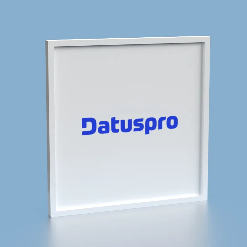
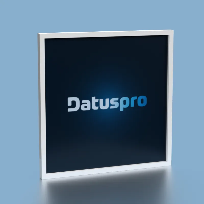
Datuspro is a data-focused brand concept — the name combines "data" with a professional suffix, suggesting expertise, structure, and precision. The logo was developed to feel analytical and trustworthy, suitable for a data consultancy, analytics platform, or business intelligence service. Clean geometry and a restrained colour palette reinforce the sense of clarity and rigour.
Merandor
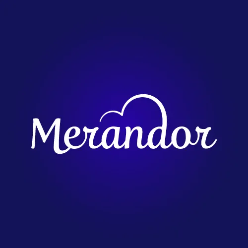
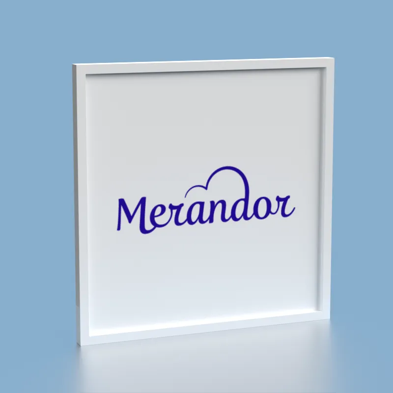
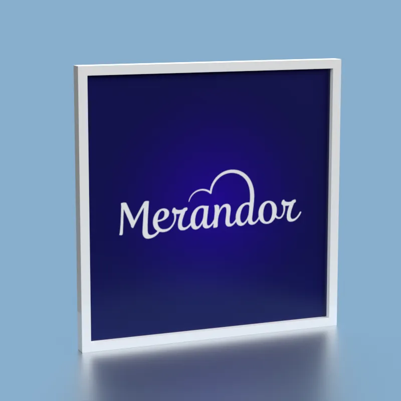
Merandor has a more evocative, character-driven quality — the name suggests exploration, movement, and ambition. The brand was developed for a concept that needed to feel dynamic and forward-looking, without sacrificing clarity. The mark works across both light and dark backgrounds, giving it the flexibility needed for digital-first brands that appear across many different contexts.
Uxlo
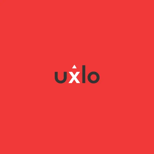
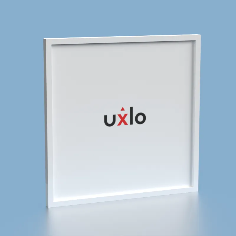
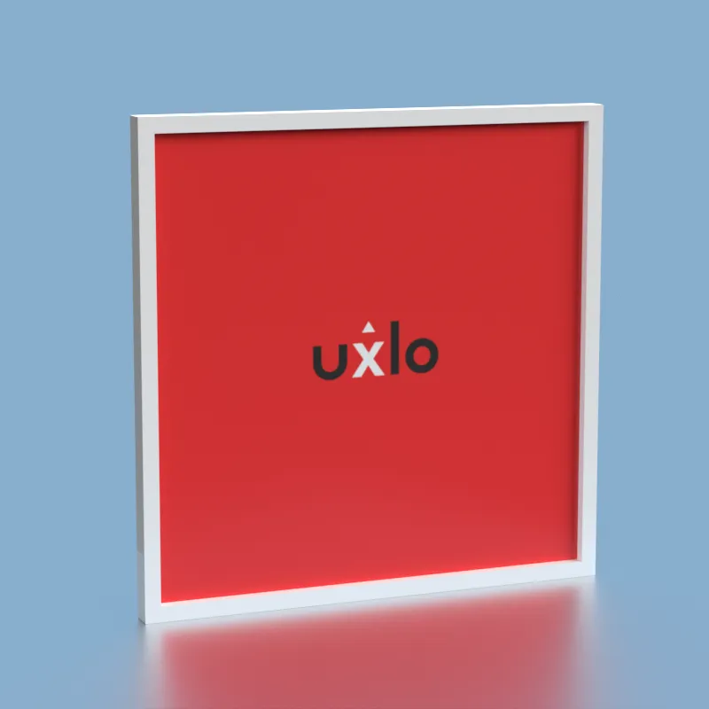
Uxlo is the most minimal of the three — a short, punchy name that implies speed and simplicity. The brief pointed toward a tech or UX-adjacent service, and the mark was designed to reflect that: tight, confident, and completely uncluttered. Short brand names carry a particular challenge — there is very little to hide behind, so every decision about letterform, weight, and spacing is immediately visible. Uxlo's mark holds its own precisely because of that constraint.
Scope of work
- Platform logo and visual identity for Domazinga
- Three distinct brand identities: Datuspro, Merandor, Uxlo
- Light and dark background variants for each mark
- Colour palette and typography per brand
- Packaged delivery with matched domain names
- Delivery in print and digital formats (SVG, PNG, PDF)
XELFIE
XELFIE is a self-checkout concept designed for rural and underserved communities — areas where traditional supermarkets are not present and residents have limited access to everyday essentials. The system is built to operate as a compact, self-service retail point, bringing convenience to places that are typically overlooked by mainstream retail infrastructure.
The brief for the logo was clear in one important respect: the brand needed to feel genuinely eco-friendly and nature-connected — not in a superficial, greenwashing sense, but in a way that reflected the product's actual purpose and context. XELFIE serves communities that are close to the land, and the identity needed to honour that.
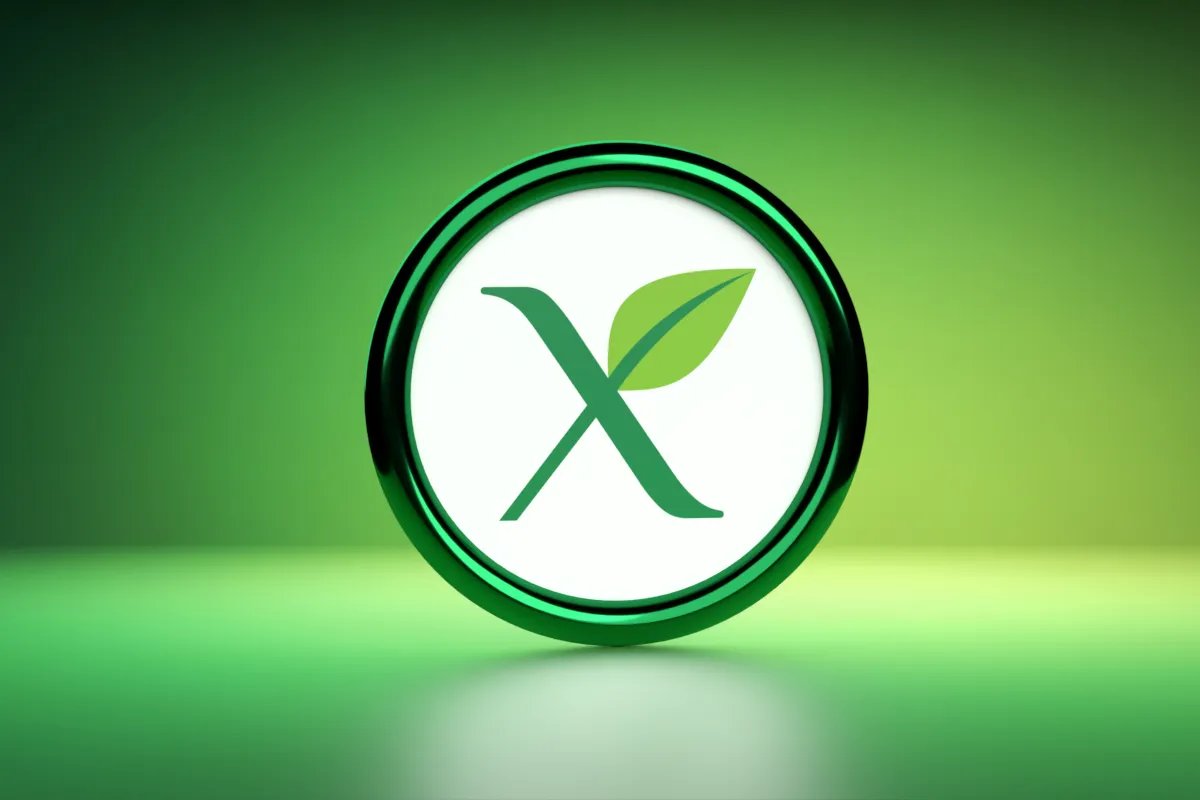
Nature-rooted without being naive. The mark draws on organic forms and earthy colour values to communicate sustainability and community — while retaining enough structure to work as a retail and technology brand. The circular badge format reinforces a sense of trust and locality.
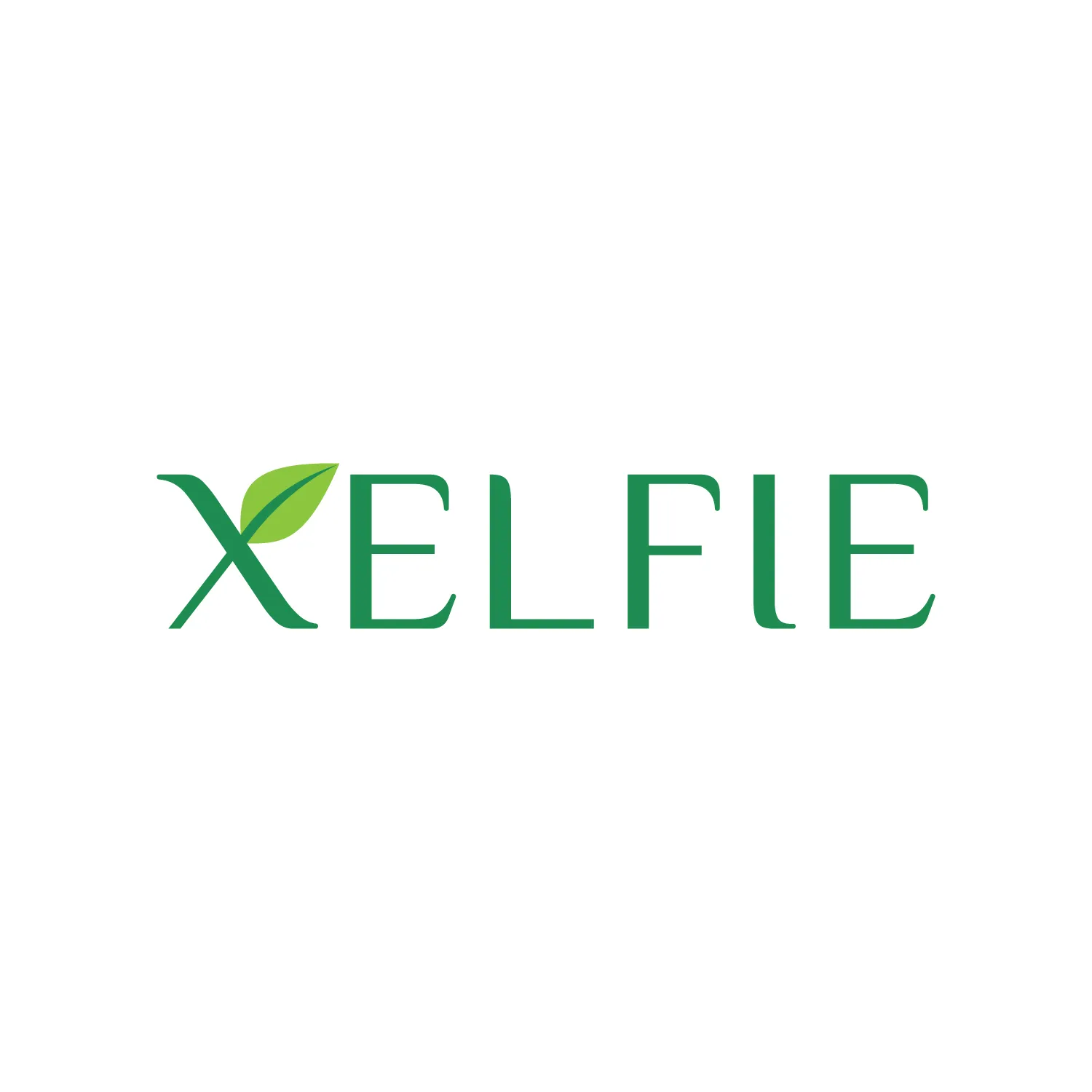
The wordmark was developed in an uppercase format to give the brand confidence and presence — important for a retail concept that needs to be immediately identifiable in physical space. The uppercase treatment also pairs well with the circular badge form, creating a versatile identity system that works at signage scale as well as on packaging and printed materials.
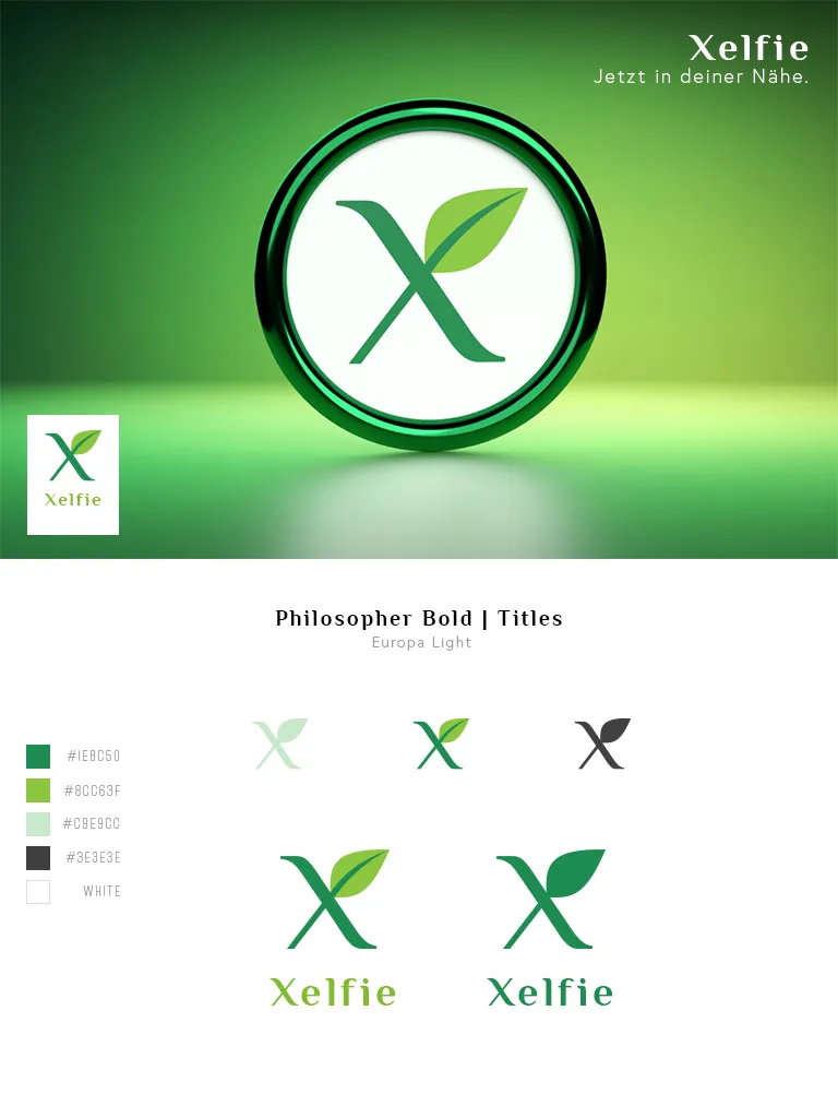
The colour palette was developed around natural, earthy tones — greens, warm neutrals, and organic accents — each selected to reinforce the brand's eco-conscious positioning. The supporting image above shows the full colour system alongside logo variations, including reversed and single-colour versions for use across different print and digital contexts.
Scope of work
- Logo concept and eco-focused brand direction
- Circular badge mark and uppercase wordmark development
- Colour palette design — nature-rooted, print and digital safe
- Logo variations: full colour, reversed, single colour
- Scalability review for signage and packaging formats
- Delivery in print and digital formats (SVG, PNG, PDF)
Need a logo or brand identity?
From initial concept to final delivery — marks designed to work across print, screen, and everything in between.
Get in touch →