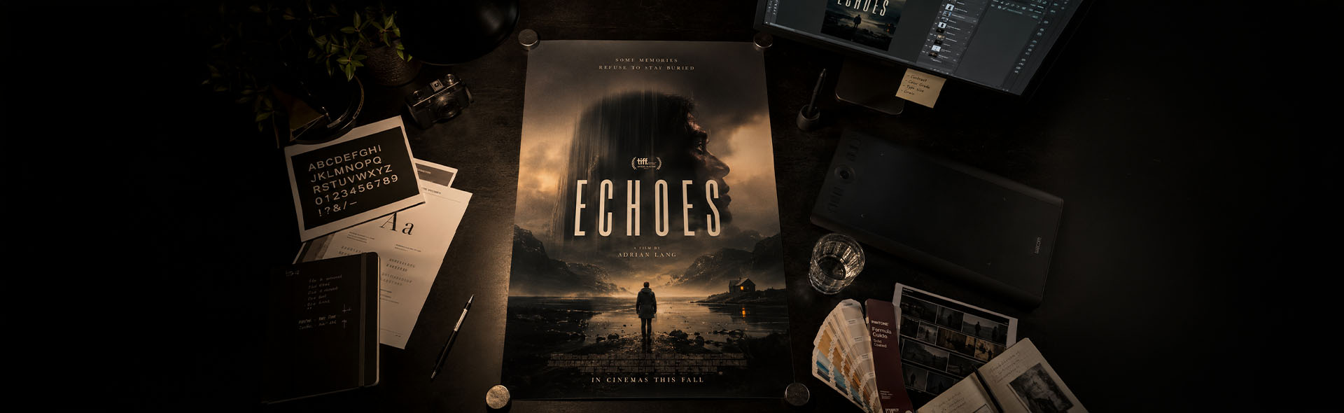
Film Poster Design for Independent Cinema
Movie posters designed for independent film
A film poster is the first thing an audience sees — before the trailer, before the reviews, before anything. For indie films, short films, and festival submissions, it carries even more weight: it has to communicate the entire mood, genre, and world of the film in a single image. These posters are designed with that pressure in mind.
Each project starts with understanding the film — its tone, its themes, the feeling it leaves behind. From there, the design process moves through image direction, typography selection, layout composition, and final execution in Adobe Photoshop, with support from the broader Adobe Creative Suite. Every element — the typeface, the color palette, the placement of text — is a deliberate creative decision.
Understanding the story, genre, tone, and intended audience — then defining the visual direction and key image concept before anything is designed.
Selecting or directing the key image, defining the typography system — font, weight, size, color, placement — and establishing the full color palette.
Final poster assembly in Photoshop — gradient work, layer blending, billing block, and all typographic elements — delivered print and web ready.
Robogamy — AI, Trust, and the Future of Love
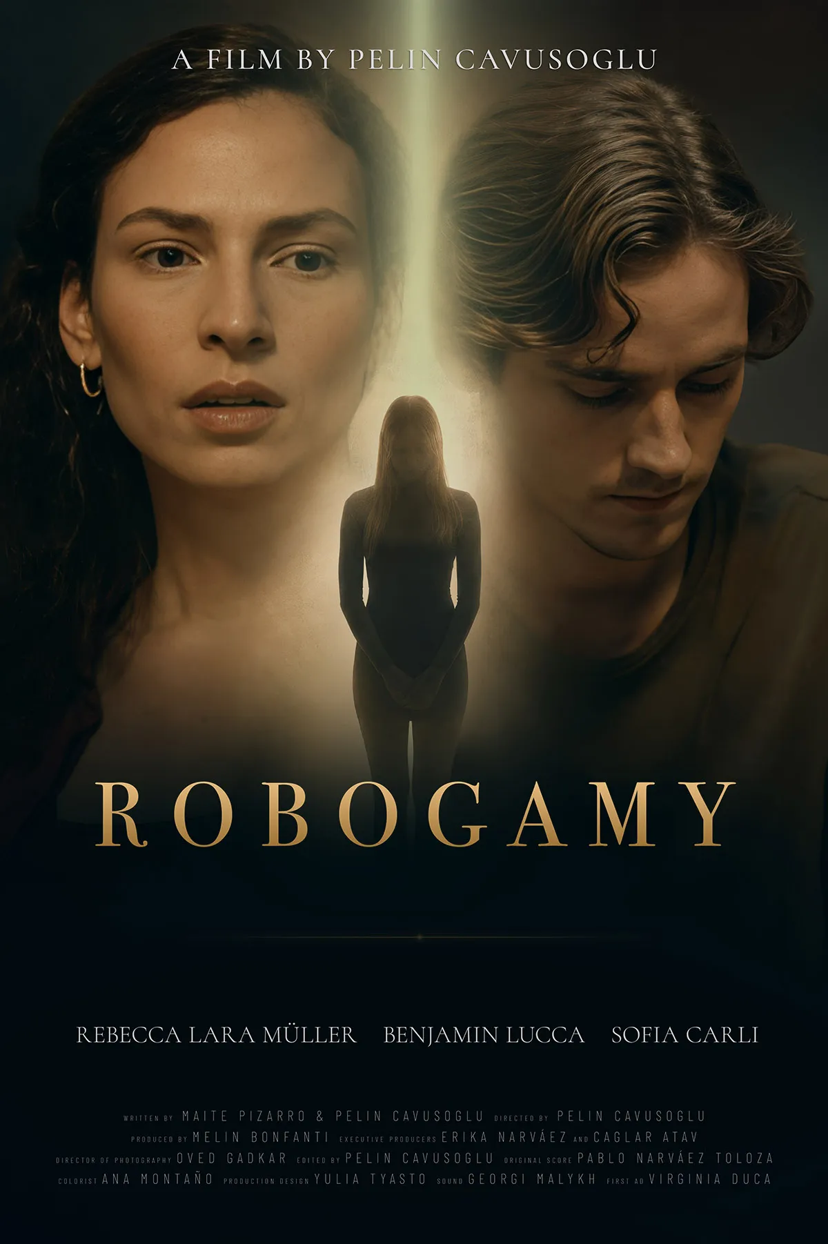
Robogamy — Film Poster · Adobe Photoshop
Robogamy explores trust, jealousy, and emotional dependency in an age where artificial intelligence is becoming increasingly present in everyday life. As a couple prepares for marriage, a seemingly simple test of loyalty evolves into a confrontation with questions of control, surveillance, and the nature of intimacy itself. Through this near-future scenario, the film reflects on how emerging technologies may reshape human relationships, influence the way we love and trust, and challenge our understanding of connection.
Cold sci-fi dread with a human core
The central challenge of the Robogamy poster was capturing a film that is simultaneously intimate and technological — emotionally warm but visually cold. The design leans into the near-future tension of the story: a palette that feels clinical and digital, typography that carries a quiet sense of surveillance, and a composition where the human element is present but somehow observed. The poster had to feel like it belongs in a festival programme alongside prestige sci-fi — not a low-budget student project, but a film with something real to say.
Typography was selected to feel precise and slightly cold — the kind of type that suggests systems, monitoring, and control without ever becoming overtly sci-fi. Color grading on the key image was pushed toward desaturated blues and cool neutrals to reinforce the near-future setting. The billing block follows standard short film festival convention — keeping the poster credible in a professional context.
Working with Pelin Cavusoglu
Robogamy is directed by Pelin Cavusoglu — a Berlin-based director, filmmaker, and videographer whose clarity of vision made this collaboration genuinely enjoyable. Pelin brought a strong sense of what the film needed to feel, which made every design decision easier and more purposeful. Working with a director who understands both the story and the image is rare, and it shows in the result. Thank you, Pelin — it was a pleasure from start to finish.
↗ Visit pelincavusoglu.comLongitude of Grief — A Poetic Road Film Poster
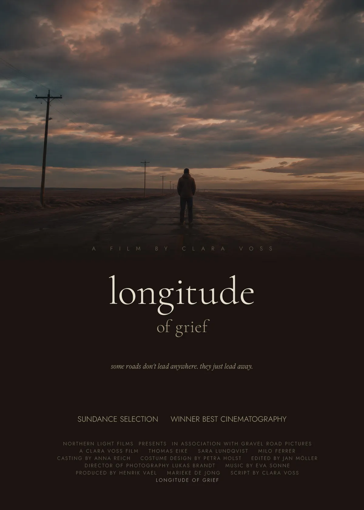
Longitude of Grief — Film Poster · Adobe Photoshop · Freight Display Pro
Longitude of Grief is a quiet, devastating road film about a man who walks away from everything he knew — not toward a destination, but simply away. Filmed across the flat plains of the American midwest, the story follows one week of solitary driving, chance encounters, and the slow realization that distance from pain is not the same as healing. A film about the geography of loss.
Dramatic atmosphere through light, scale, and restraint
The entire design strategy for this poster was built around one idea: making the viewer feel small. The key image was directed to place a lone figure against an enormous, bruised sky — a vast flat landscape with telegraph poles disappearing into the distance. The figure occupies maybe five percent of the frame. That emptiness is the point. The dramatic atmospheric lighting — golden hour desaturated to near-grey — does the emotional work before a single word is read. Typography in Freight Display Pro Book Italic was chosen for its quiet elegance: lowercase, slightly broken, like a person who has run out of the energy to shout.
The palette avoids pure black and white entirely. Every tone lives in warm browns, bone whites, and faded gold — matching the drained emotional temperature of the image. The title splits across two lines: "longitude" large in warm bone white, "of grief" smaller in faded gold below — the title exhales downward. A dark gradient dissolves the road into the text zone so the image and typography feel like one continuous surface rather than two separate layers.
- AI-assisted key image generation with custom cinematic prompt direction
- Full poster layout and composition in Adobe Photoshop
- Custom gradient work to blend image into text zone seamlessly
- Typography: Freight Display Pro (Adobe Fonts) + Jost (Google Fonts)
- Complete billing block in standard festival poster convention
- Delivered at 1200 × 1680px, optimised for web display
The Pale Geometry — A Cerebral Horror Film Poster
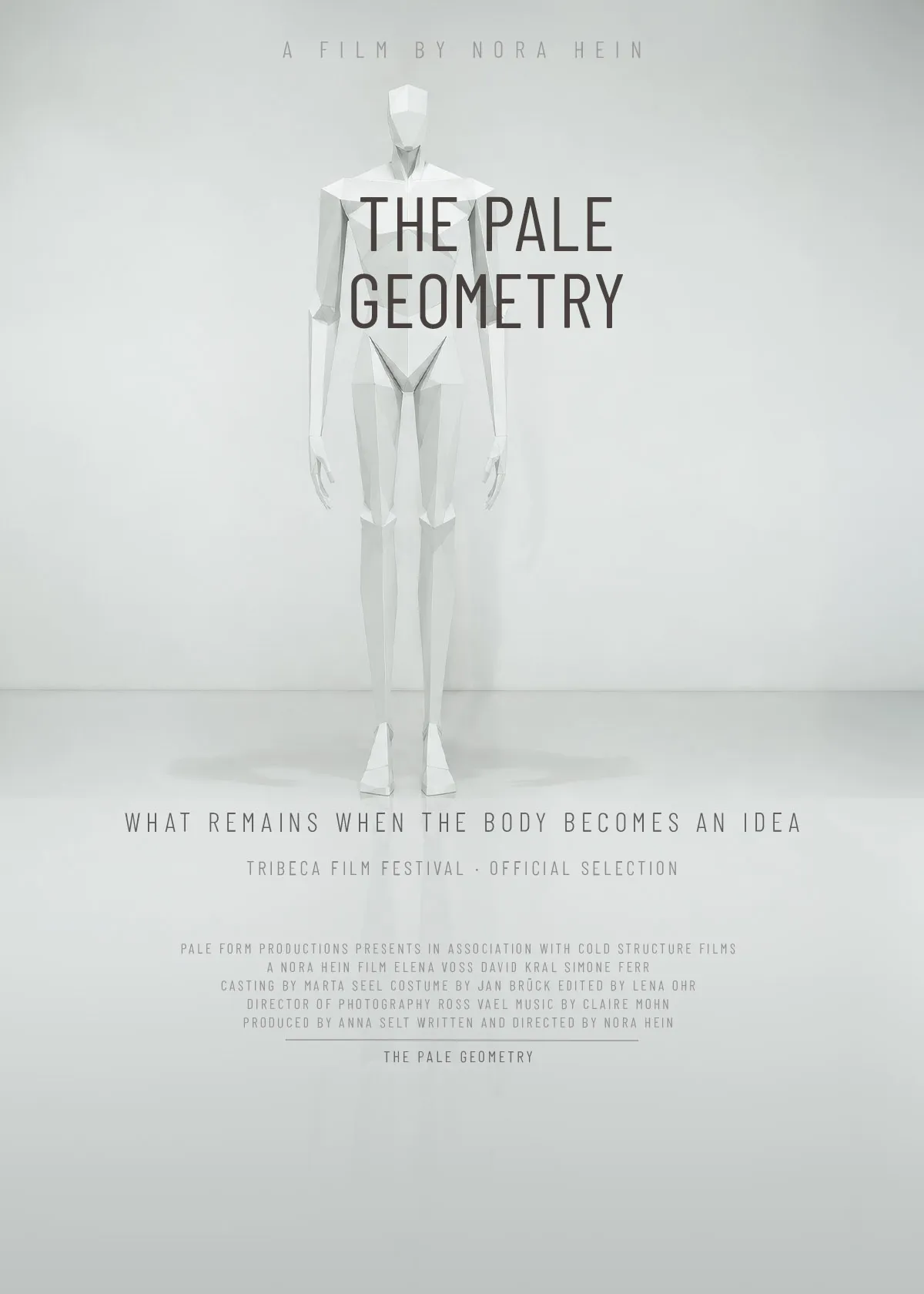
The Pale Geometry — Film Poster · Adobe Photoshop · Barlow Condensed
The Pale Geometry is a body horror film with no blood. A woman wakes to find her body slowly reorganizing itself into geometric forms — joints becoming angles, flesh becoming planes. Doctors find nothing wrong. The scans are clean. But the mirror doesn't lie. A film about dissociation, identity, and the terror of becoming a shape instead of a person. Cold, clinical, and deeply unsettling — horror through wrongness, not violence.
Uncanny feeling through clinical precision
This poster had to look like a medical file that had become aware of itself. The horror of the film is not in violence or darkness — it is in things being slightly, wrongly off. The design mirrors that. A full-bleed white clinical room. A geometric figure that is almost human but not quite. Typography in Barlow Condensed placed directly over the figure's torso — not labeling it from below, but merging with the body. The title is not announcing the film. It is occupying it. Even the slight asymmetry between figure and type was kept intentional: in a poster this controlled, anything misaligned feels like a symptom.
Red on white is the obvious horror choice. It was rejected. Red announces danger. This film's horror is quieter than that — it creeps up. Near-black type on clinical white feels more unsettling because it looks like documentation. The title color #1C1410 is not pure black — it carries a faint warmth, almost like something organic trying to look neutral. That tension is the point.
- AI-assisted key image generation with revised prompt to achieve clinical geometric aesthetic
- Full poster layout and composition in Adobe Photoshop
- Full-bleed white treatment — no gradient, no dark zone, text floats on the image
- Typography: Barlow Condensed (Google Fonts) — weight refined from Bold to Regular for uncanny fragility
- Complete billing block in standard festival poster convention
- Delivered at 1200 × 1680px, optimised for web display
What the film poster design service includes
Every poster is designed as a complete piece of key art — from the initial concept through to a delivery-ready file. Whether you're submitting to festivals, promoting a short film online, or building out a full campaign, the output is professional, considered, and built around the specific world of your film.
- Brief and film review — understanding your story, tone, genre, and target audience
- Key image direction — working with your existing stills, or prompting and generating a custom image
- Full typography system — font selection, hierarchy, size, color, and placement
- Color palette definition — harmonised with the image and emotional tone of the film
- Composition and layout in Adobe Photoshop — gradient work, layer blending, text zones
- Billing block — cast, crew, production company, and awards line in standard festival format
- Tagline copywriting if needed
- Delivery in web-optimised and high-resolution print-ready formats
Other DTP project areas
Have a film that needs a poster?
Short film, indie feature, festival submission — let's build key art that does your film justice.
Get in touch →