
Website Design Projects
Websites that are designed to perform
Every website project starts with understanding the client's goals — then moves through a structured process from wireframe to launch. The design phase begins in Adobe XD, where layout, structure, and visual direction are defined as interactive mockups before a single line of code is written. Once approved, the project moves into the build phase — in HTML/CSS, WordPress, or Webflow, depending on what fits the client's needs best.
Understanding the goals, content structure, and target audience — then building low-fidelity wireframes to map out the layout before any visual decisions are made.
Full visual mockups with typography, colour, imagery, and interactive prototyping — reviewed and approved by the client before development begins.
Development in HTML/CSS, WordPress, or Webflow — clean code, responsive layout, and platform-ready delivery.
LPN — Localization Production Network
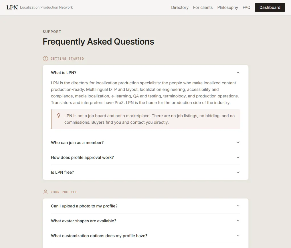
LPN is the largest and most prominent project in this portfolio — a curated directory for localization production specialists: the people who make localized content production-ready. Translators and interpreters have ProZ. LPN is the home for the production side of the industry.
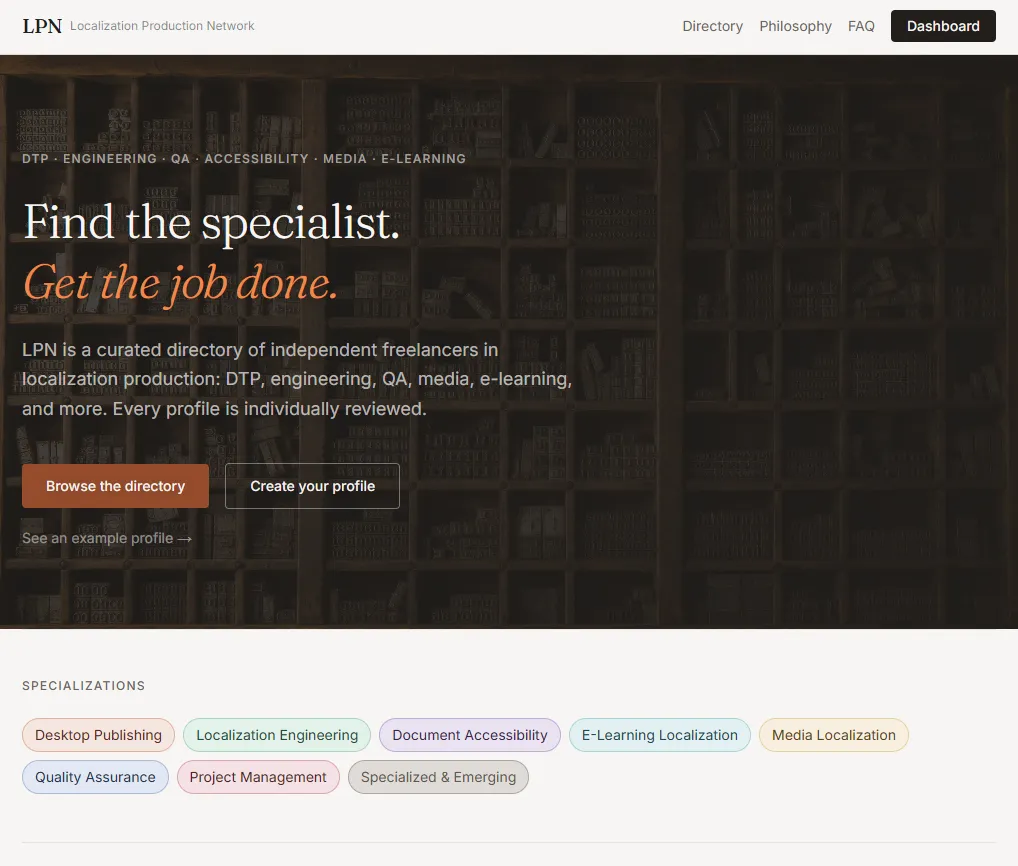
The LPN homepage — a directory built around localization production disciplines.
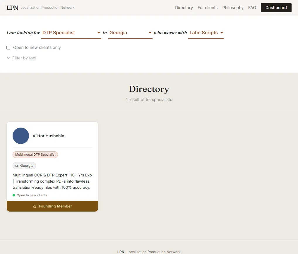
The directory spans the full production stack — multilingual DTP and layout, localization engineering, accessibility and compliance, media localization, e-learning, QA and testing, terminology, and production operations. Specialists are grouped by discipline, so a project manager can go straight to a DTP specialist, an RTL typesetter, or a CJK typesetter without sifting through unrelated profiles.
Every profile is individually reviewed
LPN is a curated network, not an open listing. Each specialist profile is checked before it goes live, so the directory stays focused on people who can actually deliver production-ready work. That review step is what separates a directory agencies can trust from a noisy, unfiltered one.
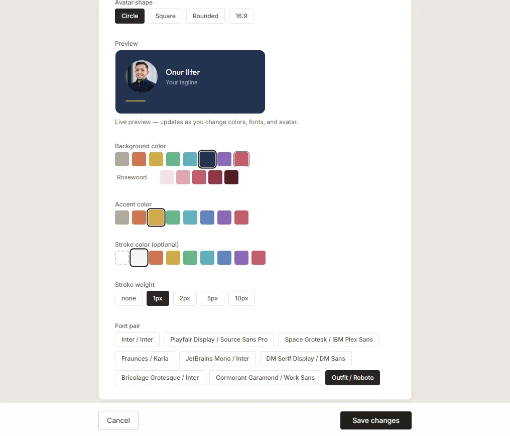
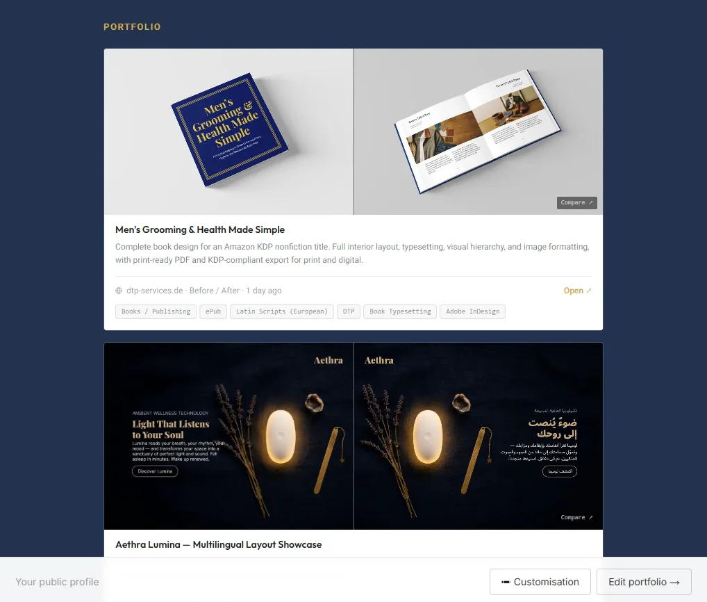
For agencies and clients, the directory is fully browsable. Filtering narrows specialists by discipline, language, software, and availability — and every specialist can customise their own profile to surface the tools, language pairs, and sample work that matter most.
If you are sourcing production talent, the client side of LPN is built around how agencies actually search — by capability, not guesswork. Filter, shortlist, and reach out directly. Questions about vetting and how listings work are answered in the LPN FAQ.
- Curated directory with individually reviewed specialist profiles
- Filtering by discipline, language, software, and availability
- Customisable specialist profiles — tools, language pairs, and portfolio samples
- Discipline pages for DTP, RTL and CJK typesetting, engineering, QA, and more
- Dedicated client flow for sourcing and shortlisting production talent
- Structured FAQ covering vetting, listings, and how the network works
Repertus — Software Company Website
A corporate website for Repertus, a Berlin-based software company offering custom software development, e-commerce solutions, and their own POS product JUNUX. The design required a professional, trust-building tone suited to a B2B technology brand, with a clear service hierarchy and easy navigation across multiple product areas.
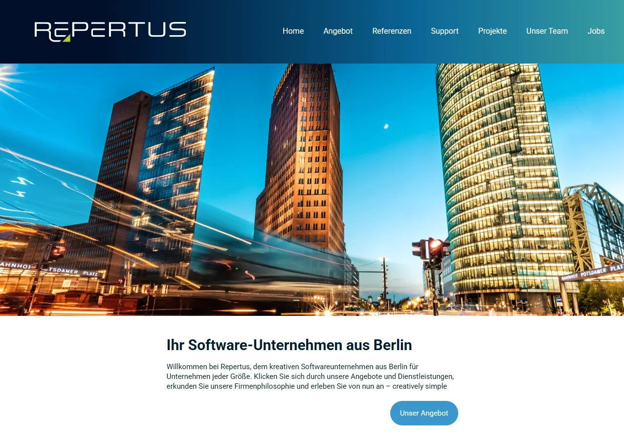
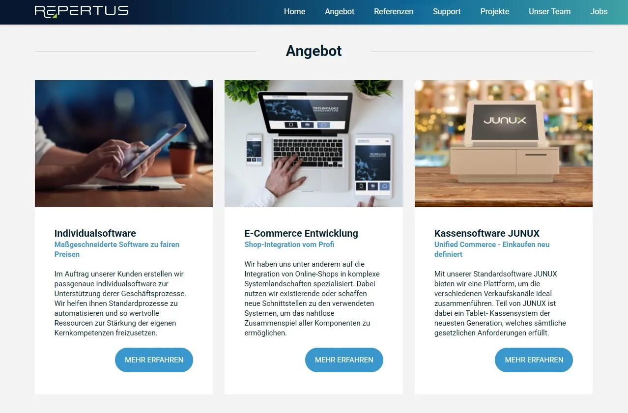
Structured content for a multi-product brand
Repertus offers three distinct services — custom software, e-commerce integration, and JUNUX — each needing its own clear entry point. The homepage was designed to present all three without overwhelming the visitor, using a clean card-based service overview and a strong hero with a clear call to action. Colour-coded navigation helps users self-select their path quickly.
JUNUX — Shopware POS System
A dedicated product website for JUNUX, the unified commerce POS solution from Repertus. Targeting retail businesses running both physical stores and online shops, the site needed to clearly communicate a complex technical product in accessible, benefit-driven language — and convert visitors into consultation bookings.
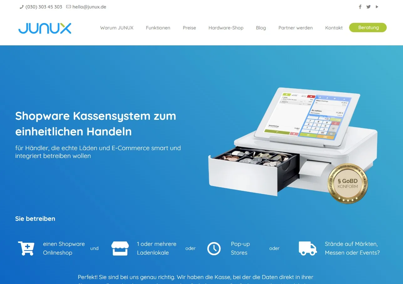
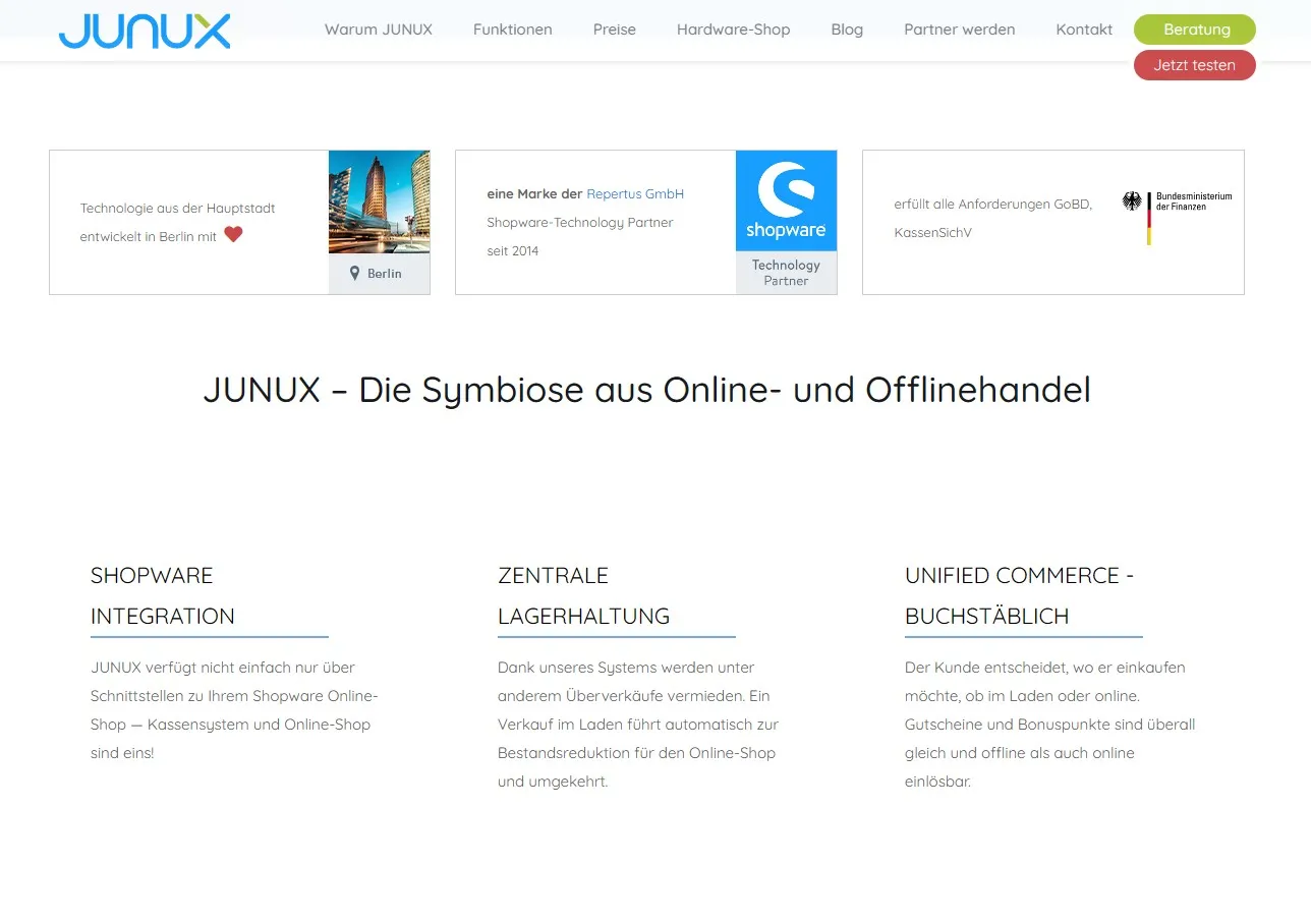
For SaaS and product websites, every section is a decision point. The JUNUX site was structured to answer the visitor's key question — "Is this for me?" — within the first scroll. Trust elements (Shopware Technology Partner badge, GoBD compliance seal, Berlin origin) were placed strategically to reduce hesitation before the consultation CTA.
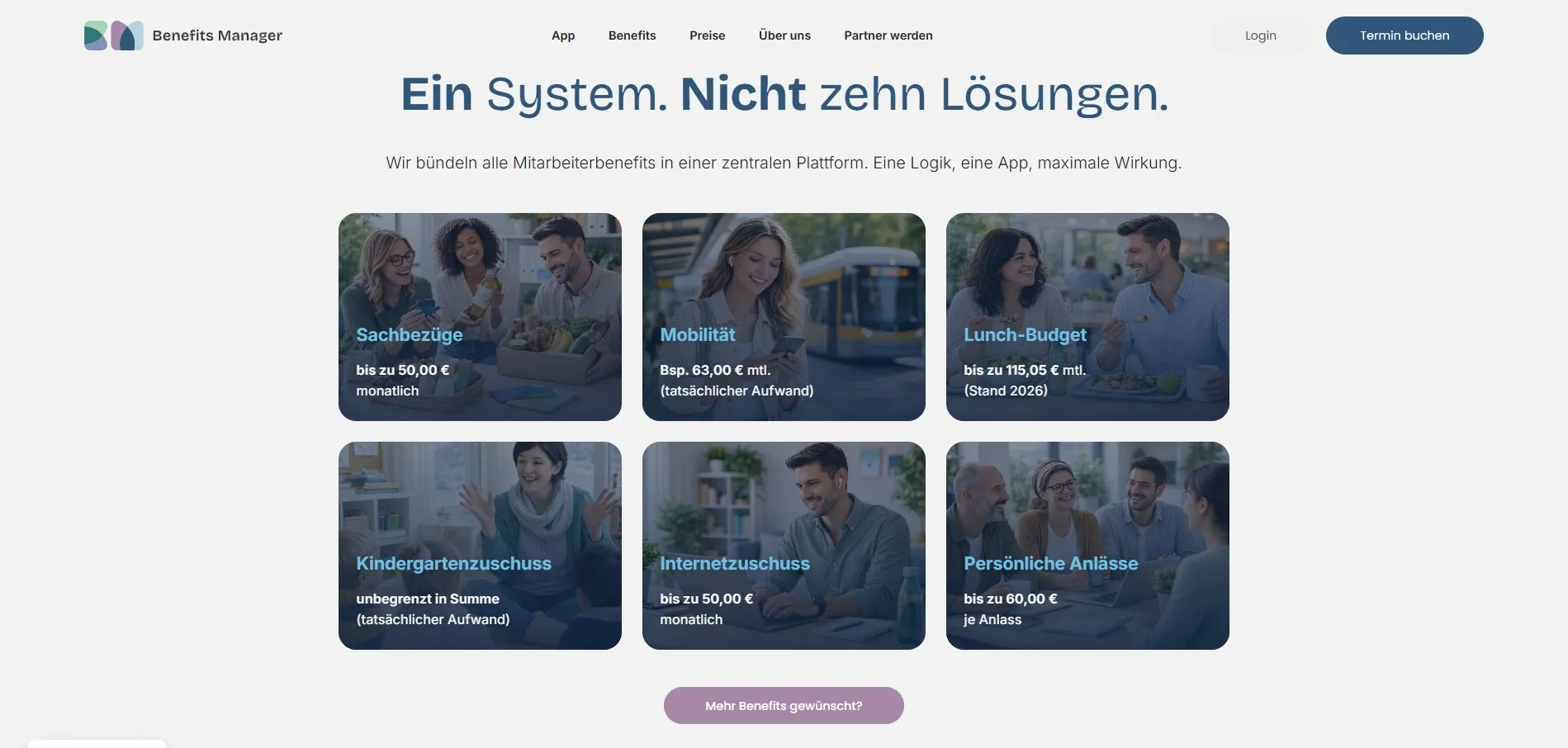
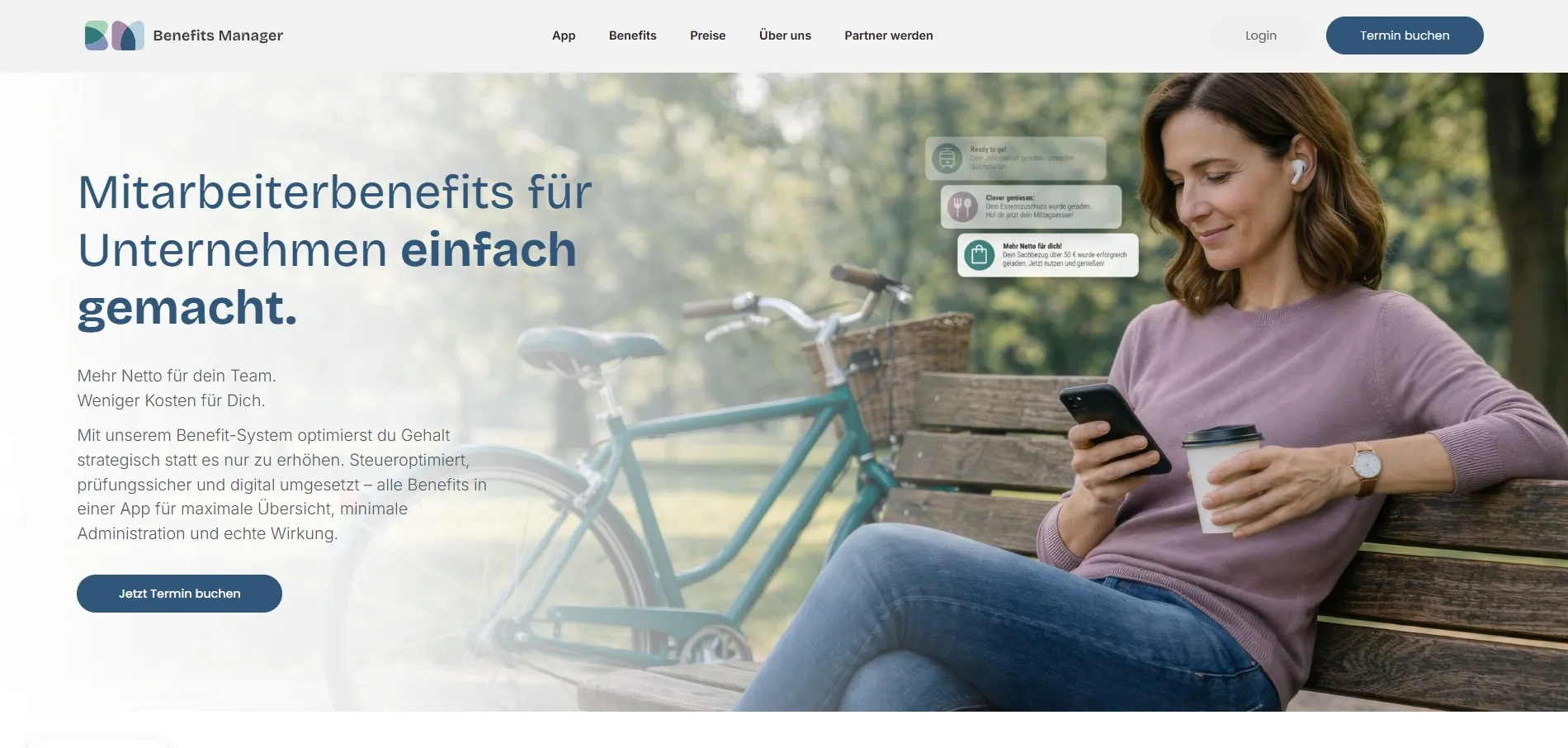
Benefits Manager — Employee Benefits Platform
A modern SaaS website for a Berlin-based HR tech company offering a centralised employee benefits management platform. The product bundles multiple benefit types — meal subsidies, mobility, childcare allowances, and more — into a single app. The website needed to reflect that simplicity: one clean, confident message that cuts through the complexity of the German benefits landscape.
When the platform matches the product
Benefits Manager was built in Webflow — the right choice for a fast-moving startup that needs to update content, test messaging, and launch new pages without developer dependency. The design uses a restrained two-tone palette, generous white space, and bold typographic hierarchy to make a complex product feel immediately approachable. The benefit card grid communicates the full offer in a single glance.
Recardy — Tax-Free Employee Benefits
A clean, content-driven website for Recardy, a Berlin fintech offering tax-free employee benefit products including meal subsidies, travel cards, and bonus schemes. The brand targets HR decision-makers and employers — so the design needed to communicate credibility, compliance, and ease of use without feeling overly corporate.
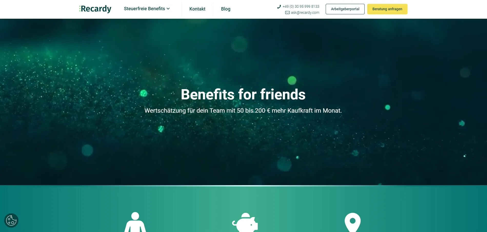
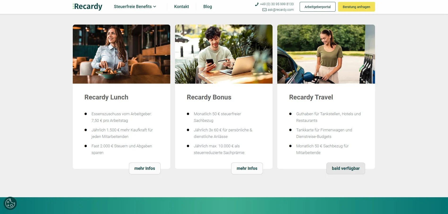
Recardy's teal and dark green palette was defined through the Adobe XD mockup phase — tested across hero, card, and CTA components before a single line of code was written. The product cards use a consistent image-plus-list structure that makes comparing benefit types effortless. The overall tone sits between fintech precision and HR warmth.
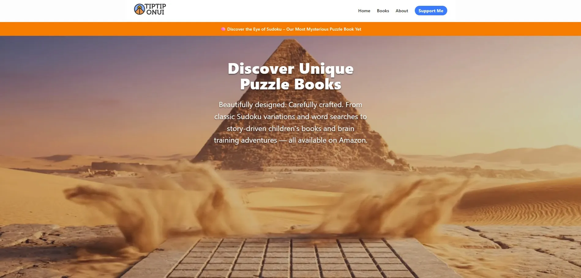
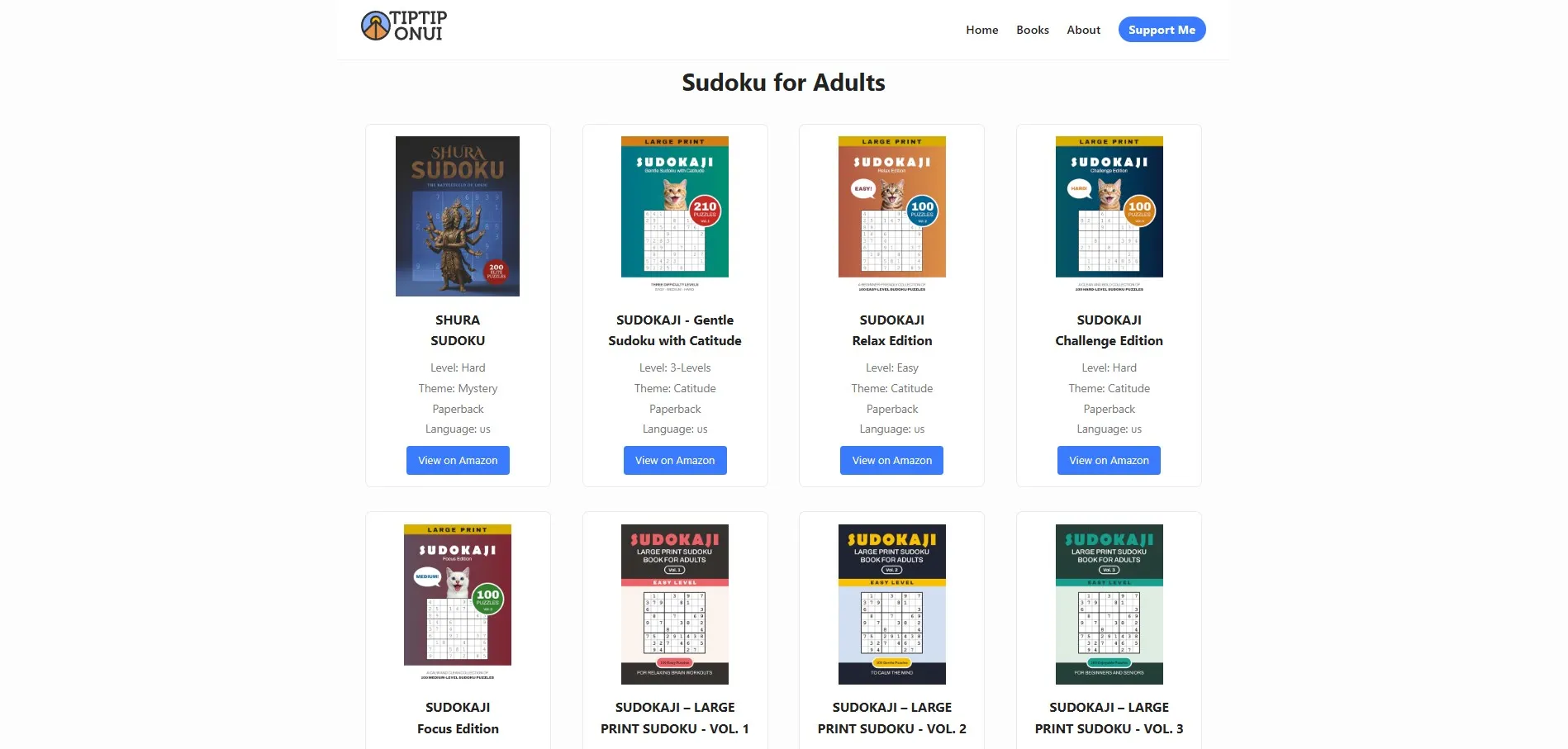
TipTip Onui — Puzzle Book Publisher
A publisher website for TipTip Onui, a puzzle book brand producing Sudoku, word search, and children's logic books — all available on Amazon. The site serves as both a brand home and a product catalogue, showcasing the full range of titles across age groups and difficulty levels. Visitors can browse the catalogue and link directly to Amazon listings.
From book layout to live website
TipTip Onui is a project where the DTP and web work go hand in hand. The book interiors and covers were designed and prepared for Amazon KDP — then the same titles were presented on the website, creating a consistent brand presence from printed page to digital storefront. This is the kind of end-to-end publishing workflow that sets a self-publishing brand apart from generic Amazon listings.
- Full website design in Adobe XD — desktop and mobile mockups
- Webflow development with Amazon affiliate linking
- Book catalogue with filterable grid by age group and difficulty
- Brand identity aligned with the book cover design system
- Announcement bar for new releases and promotions
What the website design service includes
Every project is scoped, designed, and delivered as a complete package — from the first wireframe to a live, responsive website. No handoffs to other agencies, no miscommunication between designer and developer.
- Discovery session — goals, audience, content structure, and competitor review
- Wireframes and site architecture before any visual design begins
- Full visual mockup in Adobe XD — desktop and mobile, with interactive prototype
- Client review and approval before the build phase starts
- Development in HTML/CSS, WordPress, or Webflow — depending on project needs
- Responsive layout — tested across desktop, tablet, and mobile
- SEO-ready markup — semantic HTML, meta tags, and page speed optimisation
- Handover with documentation, CMS training, and post-launch support
Other DTP project areas
Have a website project in mind?
From wireframe to launch — design and development in Adobe XD, Webflow, WordPress, or HTML.
Get in touch →