Multilingual DTP Projects
More than translation — typographic precision across every language
Multilingual DTP (Desktop Publishing) is the process of adapting an existing layout to a new language while maintaining the original design intent, visual hierarchy, and brand consistency. A translated document is not the same as a localised one — and the difference is immediately visible on the page.
Text expands in German. Contracts in Chinese. Flows right-to-left in Arabic. Requires specific punctuation rules in French. Every language brings its own typographic logic, and every layout must accommodate it without falling apart.
RTL vs LTR — The Core Challenge of Multilingual DTP
LanguagesArabic, Hebrew, Farsi, Urdu
Logo placementMoves from top-right to top-left to maintain visual balance
Text alignmentRight-aligned by default; entire reading flow is reversed
Columns & marginsInner/outer margins swap; multi-column layouts reverse order
Arabic typographyContextual letterforms, kashida, diacritical marks, and OpenType ligatures must be handled correctly
Bidirectional textNumbers, URLs, and embedded LTR content remain left-to-right within RTL flow (BIDI handling)
LanguagesEnglish, German, French, Spanish, Chinese
Text expansionGerman runs 25–35% longer than English — headings, buttons, and captions all need re-fitting
French punctuationNon-breaking spaces before : ; ! ? and guillemets « » instead of quotation marks
HyphenationGerman compound words require language-specific hyphenation dictionaries — wrong settings cause overflow or broken text
CJK rulesChinese, Japanese & Korean use no word spaces and follow strict line-break rules (kinsoku shori)
Font coverageSource fonts often lack glyphs for accented or non-Latin characters — substitution must preserve brand identity
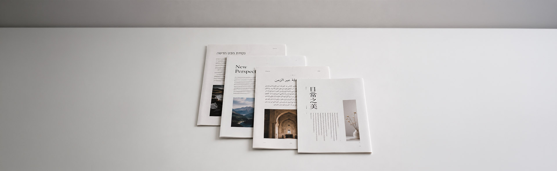
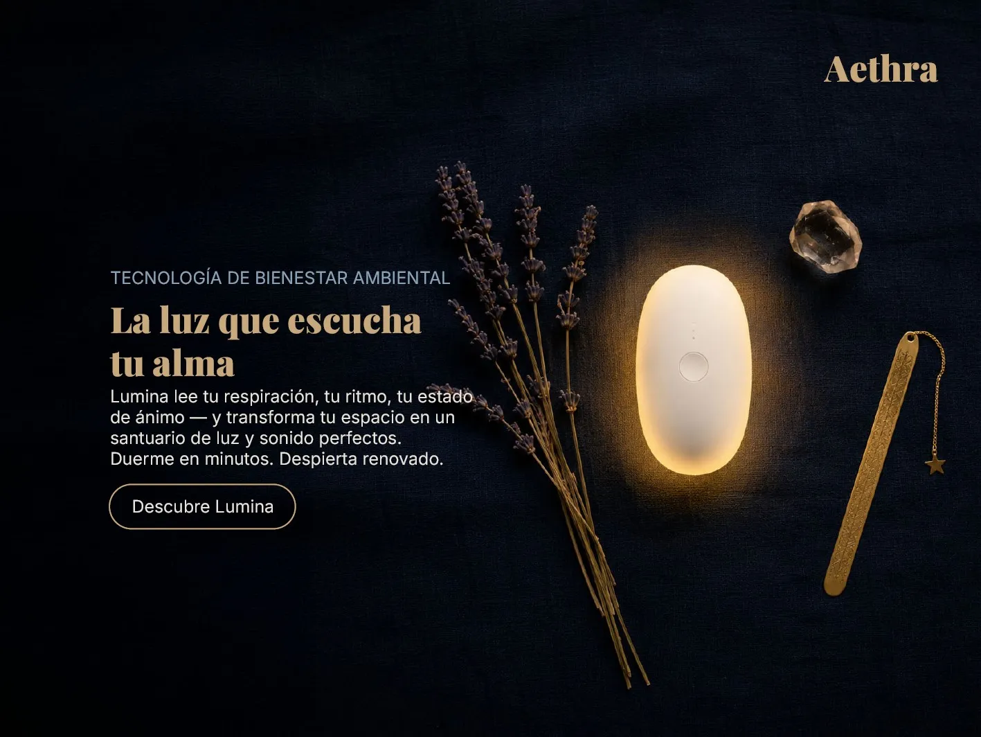
Aethra Lumina — Multilingual Layout Showcase
A showcase project demonstrating full multilingual layout adaptation across four languages and two script directions. The brief: a luxury editorial layout — consistent brand identity, correct typographic conventions, and cultural sensitivity across every version.
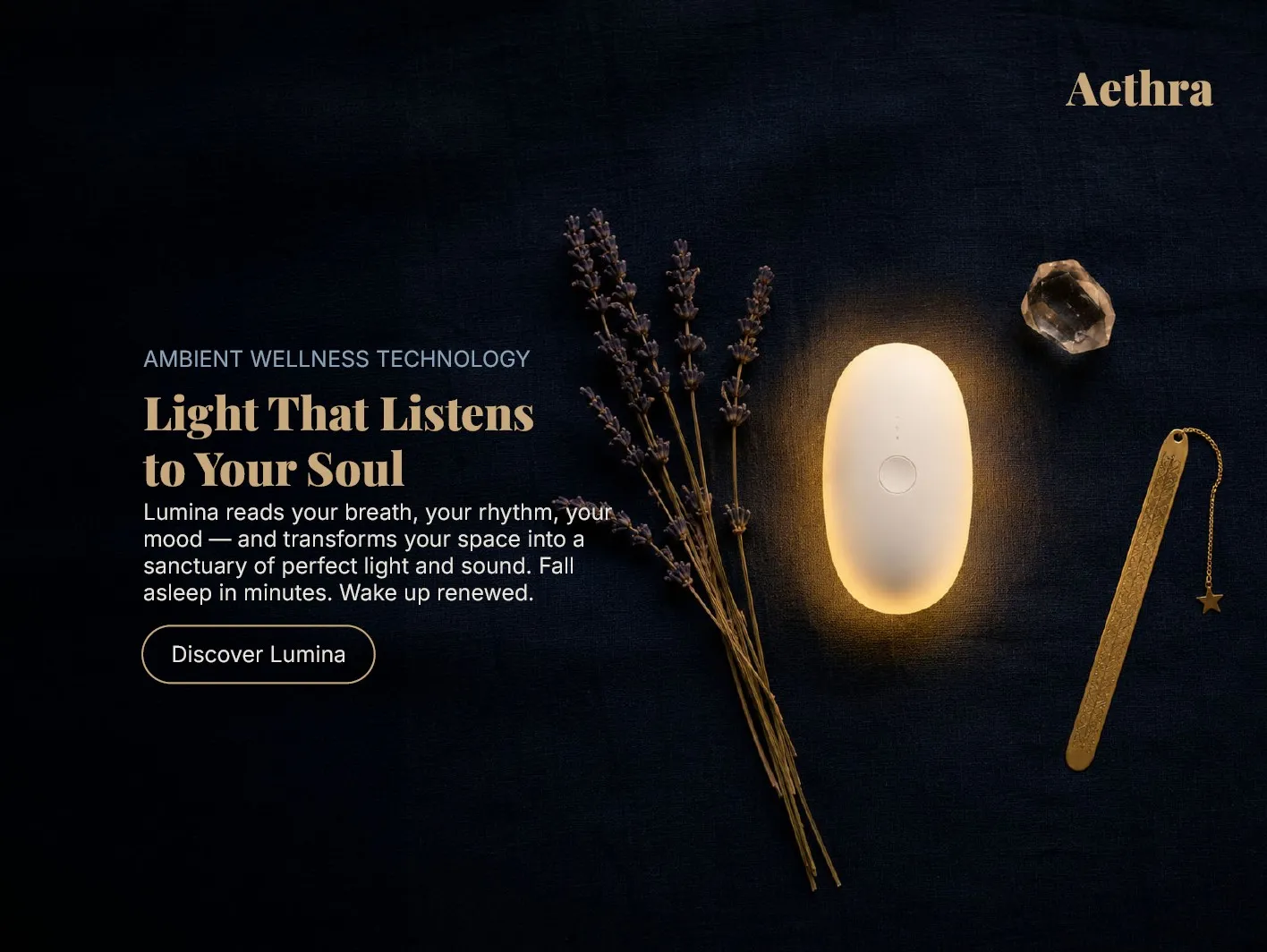
English (source) — left-aligned, LTR typographic flow
The layout is fully mirrored — not just the text
When adapting an English layout to Arabic, every element shifts. The logo moves from top-right to top-left. The text block migrates to the right. Text aligns right. The reading flow reverses completely. Diacritical marks are calibrated for brand copy — present where they add poetic quality, removed where they would feel over-formal for a luxury context.
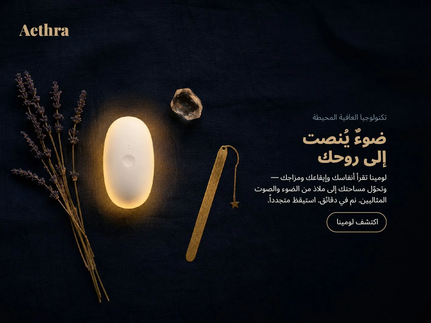
Arabic — full RTL layout with mirrored composition
Chinese body text uses no word spaces — line breaks follow kinsoku shori rules. The product name 流明 (Liúmíng) was chosen to carry the same poetic meaning as "Lumina" in Chinese. Transliteration alone is never enough for luxury brand copy.
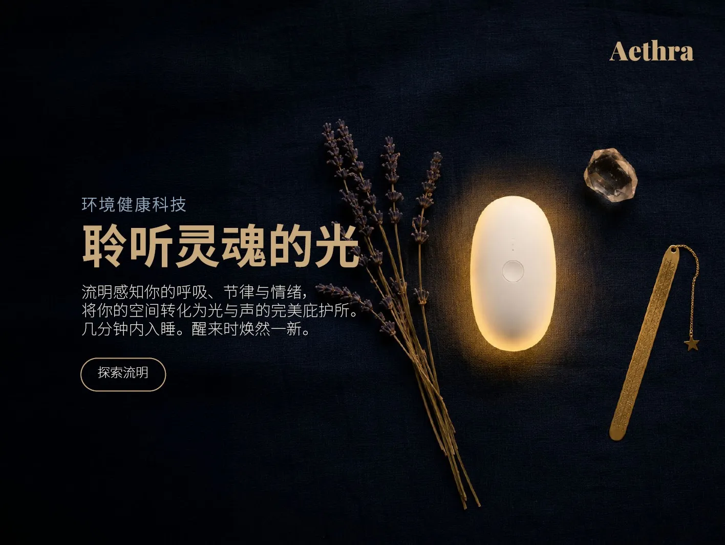
Chinese (CJK) and Spanish — both adapted from the same English source layout
Even punctuation is language-specific
English uses an m-dash (—) without spaces. German uses an en-dash (–) with spaces. French requires a non-breaking space before the dash. Arabic uses the m-dash within RTL flow. Chinese uses a doubled full-width em-dash (——). These details are invisible when correct — and immediately noticeable when wrong.
Shura Sudoku — Multilingual Book Cover Adaptation
A complete book cover DTP project across three languages for a puzzle book series. The English source was adapted to German and French — each requiring different typographic handling, text length management, and language-specific conventions, while preserving the dramatic dark design across all versions.
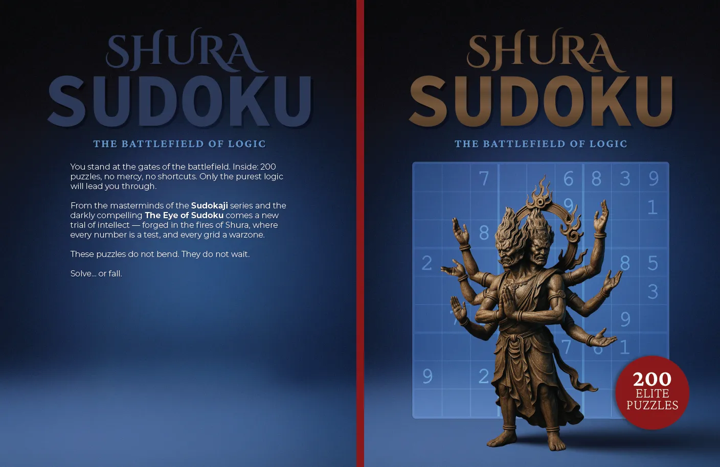
English (source) — "The Battlefield of Logic"
German runs longer — the layout must breathe with it
German text typically expands 25–40% compared to English. Back cover body text required careful tracking adjustment, language-specific hyphenation, and reflow to avoid widows and orphans. The en-dash (–) with spaces replaces the English m-dash — a detail many DTP operators miss. The badge copy becomes "Elite-Rätsel" — the hyphen is mandatory in German compound nouns.
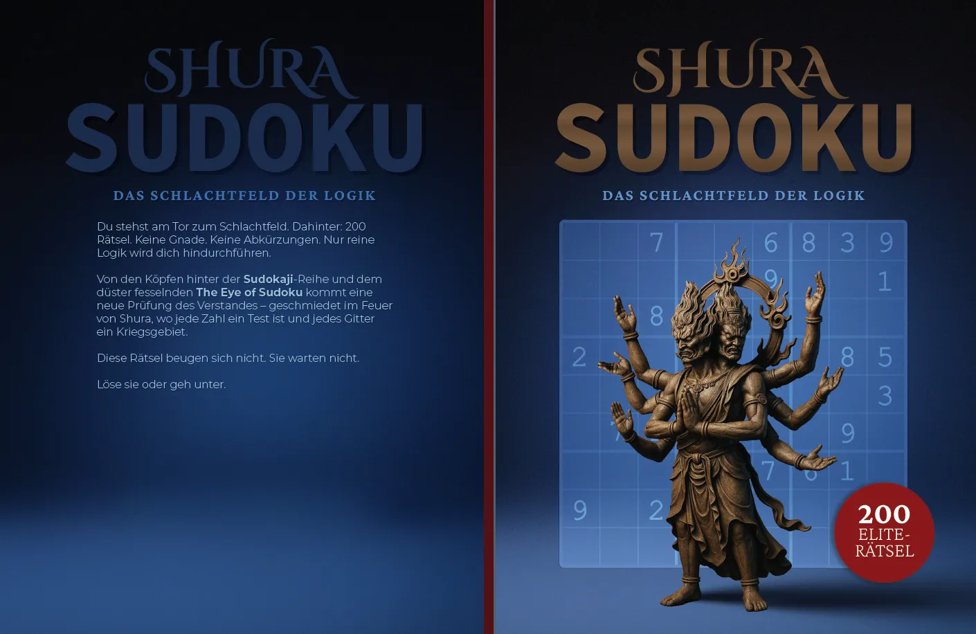

German and French — same design system, language-specific typographic rules applied throughout
French requires non-breaking thin spaces before the colon, semicolon, exclamation mark, and question mark — frequently missed in DTP work. On the French cover: "Derrière : 200 énigmes" — the space before the colon is intentional and correct. French also uses guillemets (« ») rather than straight or curly quotation marks.
Scope of work
- Full cover layout adaptation from English source (InDesign)
- Language-specific typographic rules per locale — EN / DE / FR
- Text expansion handling and tracking/hyphenation adjustments
- Badge copy localisation — Elite Puzzles → Rätsel → Énigmes d'Élite
- Print-ready PDF export with bleed, crop marks, and correct colour profile
- Amazon KDP and IngramSpark compliant file delivery
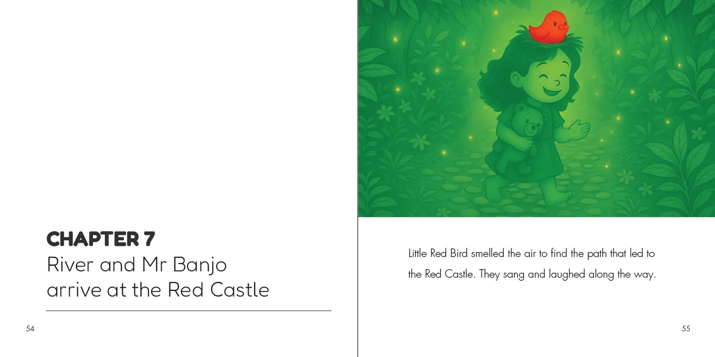
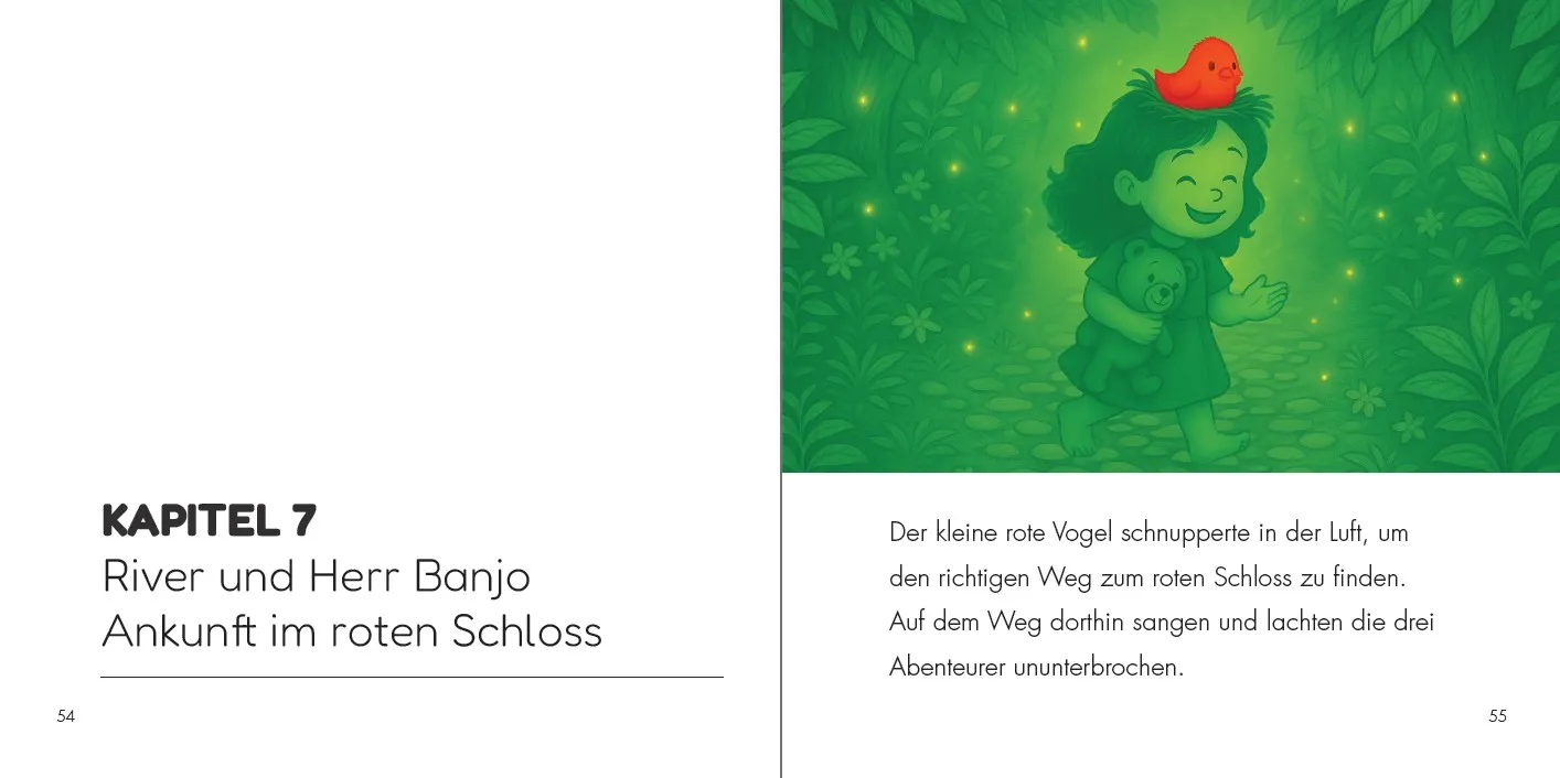
River and Mr Banjo — Interior Layout Localisation
Interior page adaptation for a children's illustrated storybook from English to German. Multilingual DTP for children's books brings its own challenges: text must remain readable and age-appropriate, line breaks must feel natural when read aloud, and the layout must stay emotionally consistent with the illustrations.
English (source) and German — side-by-side interior spread comparison
Every line break is a creative decision
In a children's book, text isn't just typeset — it's paced. Line breaks affect how a parent reads aloud. In the German version, "River und Herr Banjo" replaces "River and Mr Banjo" — a culturally correct adaptation. The single word "Ununterbrochen" (meaning "without stopping") replaces three English words — and that expansion must be absorbed into the spread without disrupting the visual balance.
Good multilingual DTP works hand in hand with good localisation — not just word-for-word translation. Character names, cultural references, and reading rhythm all need to feel native in the target language, not imported from the source.
Need to Prepare a DTP Project Brief?
Create a structured project brief in your browser before contacting a DTP provider. Add your file format, page count, languages, deliverables, and common production risks. No upload, no storage, no sign-up.
Prepare Project BriefYou can use the generated brief with DTP Services Berlin or any other agency.
What multilingual DTP covers
Every multilingual project is handled end-to-end — from receiving the translated text to delivering print-ready files. No guesswork, no approximations.
- Layout adaptation from InDesign, Affinity Publisher, or PDF source files
- RTL layout mirroring for Arabic, Hebrew, and Farsi
- Text expansion and contraction management across all languages
- Language-specific hyphenation, punctuation, and spacing rules
- CJK typography — Chinese, Japanese, Korean script handling
- Font selection and substitution for full Unicode and glyph coverage
- Bidirectional text (BIDI) handling in mixed-language documents
- Print-ready PDF export with bleed, crop marks, and ICC colour profiles
- Platform compliance — Amazon KDP, IngramSpark, and professional print platforms
- Proofreading coordination and final QA across all language versions
Other DTP project areas
Multilingual DTP is one part of a broader range of desktop publishing services. Explore the other project areas below.
Further reading on multilingual DTP
- What is Multilingual Desktop Publishing?
- How to prepare an InDesign file for translation
- Translating PDF files — the InDesign workflow
- DTP rate per page — what to expect
- Tips & tricks for multilingual publishing
Have a multilingual publishing project?
Book covers, interiors, editorial layouts, and marketing materials — adapted for any language, any direction, any platform.
Get in touch →