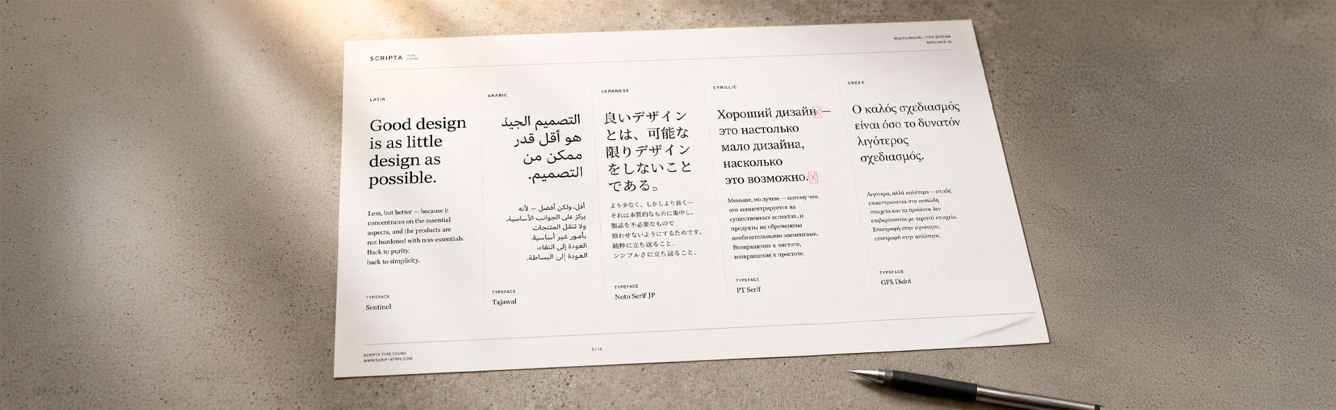
Fonts in Multilingual DTP: Why They Break and What to Use
The layout looks perfect. The translation is approved. You open the translated IDML, and the first thing you see is pink squares. Or garbled characters. Or Arabic text flowing left to right instead of right to left.
Font failure is one of the most common problems in multilingual DTP, and one of the easiest to avoid. This guide explains why it happens, which fonts cover which scripts, and how to check a project before translation begins.
Why does a font "break" after translation?
A font is not a complete alphabet. It is a set of glyphs, the character shapes its designer chose to include. Most professional fonts cover the standard Latin alphabet and common punctuation. Many stop there.
When translated text contains a character the font does not have, such as an umlaut, a cedilla, a Cyrillic letter or an Arabic ligature, InDesign has nothing to display. The result is one of three failure modes.
The [Basic] preflight profile does not check for missing glyphs, so a file with pink boxes can pass it clean and reach the printer. Add the Fonts > Glyph missing check to a custom profile, and check fonts as a separate step.
Four script groups and what each needs from a font
The script group tells you what the font has to do.
Latin Extended is the most commonly underestimated group. Most designers assume their brand font covers "European languages." Often it does not cover Polish (ą, ę, ź, ż), Turkish (ğ, ş, ı) or Vietnamese, with more than 130 accented letter forms. A font that handles French and German perfectly can still fail completely for Eastern European or Southeast Asian Latin languages.
The brand font problem, and how to explain it to a client
This is one of the most sensitive conversations in multilingual DTP. A client has invested in a brand typeface. It appears on everything. And now you have to tell them it can't be used for the Arabic version of their annual report.
Most commercial brand fonts are designed for one market, usually Western Europe and North America. Supporting Arabic, Hebrew, Cyrillic, and CJK on top of Latin requires thousands of additional glyphs, different typographic rules, and in the case of RTL languages, mirrored layout logic. Very few type foundries do this across all scripts in a single family.
A common brand font scenario
DE: Nachhaltigkeitsbericht ✓
PL: Raport zrównowaonego
RU: [substituted system font]
PL/CS/HU: Noto Sans (body) ✓
RU/UK: Noto Sans ✓
AR: Noto Naskh Arabic ✓
Present it as a brand extension decision: which font best represents the brand in markets the primary typeface cannot set? Involve the brand team early, ideally before the source document is designed.
Font coverage matrix: which fonts work for which scripts
The table shows font families often used in multilingual DTP and the scripts they cover. Coverage changes with new releases, so confirm the exact fonts and weights before a project.
| Font family | Latin Extended |
Cyrillic | Arabic / Hebrew |
CJK | Greek | Cost |
|---|---|---|---|---|---|---|
| Noto Sans / Serif Google Fonts; separate font per script | ✓ | ✓ | ✓ | ✓ | ✓ | Free |
| Source Sans 3 / Source Serif 4 Adobe / Google Fonts | ✓ | ✓ | ✗ | ✗ | ✓ | Free |
| Adobe Myriad Pro Adobe Fonts (CC) | ✓ | ✓ | ✗ | ✗ | ✓ | Adobe CC |
| Helvetica Now Monotype | ✓ | ~ | ✗ | ✗ | ~ | Paid |
| Frutiger / Neue Frutiger Linotype / Monotype | ✓ | ~ | ✗ | ✗ | ~ | Paid |
| IBM Plex Sans Google Fonts | ✓ | ✓ | ✗ | ✗ | ✓ | Free |
| Arial / Arial Unicode MS Microsoft (system) | ✓ | ✓ | ~ | ~ | ✓ | System |
| Calibri / Segoe UI Microsoft (system); Arabic and Hebrew in Segoe UI only | ✓ | ✓ | ~ | ~ | ✓ | System |
| Noto Naskh Arabic Google Fonts | ✗ | ✗ | ✓ | ✗ | ✗ | Free |
| Noto Sans CJK (SC/TC/JP/KR) Google Fonts | ✗ | ✗ | ✗ | ✓ | ✗ | Free |
Support varies between weights of the same family: a font with Cyrillic in Regular may lack it in Bold Condensed. Test the weights the layout uses with a target-language sample in InDesign's Glyphs panel.
Recommended font families for multilingual projects
Fonts to consider when a brand font does not cover a target language, chosen for script coverage, a neutral look and reliable behaviour in InDesign.
How to check a font before committing to it
Test every font against every target language. This workflow catches problems in minutes, before translation is commissioned.
Font audit workflow, before translation starts
- In InDesign, go to
Type → Glyphs. Set the font to your brand font. Look for the target language's special characters: umlauts for German (ä ö ü), cedilla for French (ç), ogonek for Polish (ą ę). Empty cells mean missing glyphs. - For a Google font, paste a target-language sentence into the preview field on fonts.google.com; missing characters show at once. For any other font, test in InDesign.
- In InDesign, set a test sentence in the brand font with
Preferences → Composition → Substituted Fontshighlighting on. Pink means missing fonts or glyphs. - For RTL languages, apply the font and switch to the
Adobe World-Ready Paragraph Composer. If letters do not join, the font does not support the script. - Run Preflight (
Window → Output → Preflight) with a profile that includes Fonts > Glyph missing as well as missing fonts.
Use this string to test a font across common European scripts in one go:
ÄÖÜäöüß · àâçéèêëîïôùûüÿ · ąćęłńóśźż · áéíóúüñ¿ · şğıİĞŞ · αβγδεζ · АБВГДЕЖЗИЙКЛМНОПРСТУФХЦЧШЩЪЫЬЭЮЯ
If the font renders all of these cleanly, it covers German, French, Polish, Spanish, Turkish, Greek, and Russian. Any pink boxes show which markets need a companion font.
Arabic and Hebrew: the RTL special case
For Arabic and Hebrew, a font problem can also be a composer problem: InDesign has to use the right text engine to set the script at all.
Standard InDesign uses the Adobe Paragraph Composer for left-to-right Latin text. For Arabic and Hebrew, you need the Adobe World-Ready Paragraph Composer. Without it, even a good Arabic font sets incorrectly: the letters do not join, or the text runs left to right.
Enabling RTL support in InDesign
- Select the Arabic or Hebrew text frame.
- Open the Paragraph panel:
Window → Type & Tables → Paragraph. - From the Paragraph panel flyout menu (top-right hamburger icon), select
Adobe World-Ready Paragraph Composer. - Set Right-to-Left Paragraph Direction in the Paragraph panel. These direction controls appear in an InDesign install with Arabic or Hebrew support.
- For mixed content, such as Arabic text with English product names or URLs, set Character Direction in the Character panel for the LTR runs inside the RTL paragraph.
In InDesign 2024 and later, a forced line break (Shift+Enter) inside an RTL paragraph can reset the character direction to left-to-right and break the Arabic or Hebrew text. Set the line break's Character Direction to Right-to-Left in the Character panel instead of leaving it at Default.
Pre-project font checklist for multilingual DTP
Run this before any multilingual project begins.
File → Package to collect the fonts. Adobe Fonts and non-Adobe CJK fonts are not copied, and the recipient needs their own licence, so name those fonts in the handoff notes.The short version
Font failure in multilingual DTP usually comes from assuming that a font designed for one market works in another. The problem tends to surface only when the translated file opens with pink boxes or a broken script.
The fix is a short font audit at the start of every project. Identify the scripts in scope, test the brand font against each one, approve companion fonts for the gaps, and document everything before translation begins.
Make the font audit a standard step in multilingual project intake. Fonts confirmed at the start avoid layout rework and late font discussions with the client.