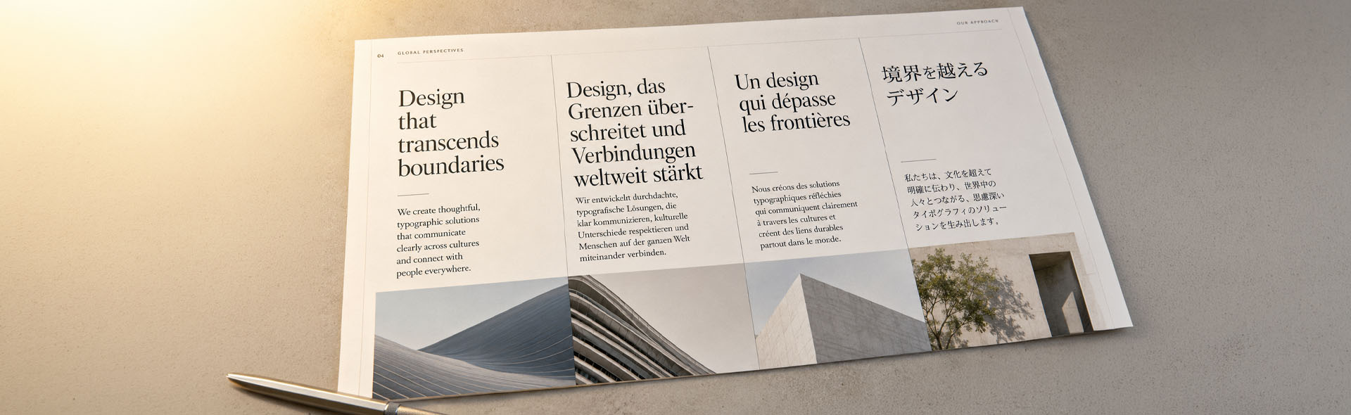
Text Expansion in Translation: Language Expansion Rates and Layout Risks
You've laid out a clean 12-page brochure. Every text box fits perfectly. Then the German translation arrives — and suddenly half the headlines overflow, captions spill into the margins, and the call-to-action button reads like a legal clause.
This is text expansion, and it breaks more multilingual layouts than any other single issue in DTP. Here's what it is, how much to expect per language, and how to design around it before it becomes a problem.
What Is Text Expansion in Translation?
Text expansion happens when a translated text is longer than the source. It's a natural consequence of how languages work: different grammar structures, compound words, longer articles and prepositions, and the absence of abbreviations all push character counts upward.
The opposite also happens. Chinese, Japanese, and Korean often produce shorter strings than English — but this doesn't mean fewer problems. It usually means too much white space, misaligned grids, and layouts that look unfinished. When this happens in a fixed text frame, the result is overset text — one of the most common issues in translated InDesign files.
Both expansion and contraction are layout problems. They just break things differently. Neither is automatically easier to handle than the other.
How Much Does Text Expand by Language?
There's no formula that works for every document, but these ranges are reliable enough to plan a layout around. The bars below show typical expansion or contraction from English source text.
The shorter the source string, the more dramatic the change. A single word — a button, a menu item, a column header — can expand by 100–300% in some languages. These aren't edge cases. They're the rule for UI elements and labels.
Real-world example: what happens to a single word
Here's the English word "Submit" translated into four languages — and what each version does to a fixed-width button:
German deserves special mention. Beyond the high expansion rate, German compound nouns are extremely long and cannot be split across lines the way English phrases can. A narrow column that works in English becomes unusable in German.
Where Text Expansion Breaks Your Layout
Expansion causes the most damage in four specific structural situations. Each one requires a different fix.
How to Design for It from the Start
The most expensive way to handle text expansion is to fix it after translation — for every language, separately. The cheapest way is to account for it during layout. Here's how.
If your document is going into 5 or more languages, have a DTP specialist review the InDesign source file before translation begins. One proactive pass costs a fraction of reactive fixes multiplied across every target language.
A Note on CJK Languages
Chinese, Japanese, and Korean typically use fewer characters than English — but this doesn't make them easier to lay out. There's a common misconception that contraction equals less DTP work. It doesn't.
Desktop
Publishing
Services
Latin characters
桌面出版
服务
→ Larger glyph height
→ Fixed frames still overflow
→ Vertical space increases
→ White space requires design adjustment
CJK characters are visually complex and require more vertical space between lines than Latin text at the same point size. A paragraph that contracts horizontally can still require more vertical space than the English original — meaning fixed-height text frames will break in CJK too. Just in a different direction. For right-to-left languages like Arabic and Hebrew, the challenge compounds further: text direction, frame mirroring, and expansion all need to be addressed together.
Quick Reference: Expansion by Language Group
Use this as a planning reference when scoping multilingual DTP projects.
| Language group | Typical expansion | Main layout risk | Minimum buffer to design in |
|---|---|---|---|
| French, Spanish, Italian | +15 – 25% | Headlines, buttons | 25% |
| Portuguese, Polish, Arabic, Hebrew | +15 – 30% | Text frames, tables | 30% |
| German, Dutch | +25 – 35%+ | Everything — especially narrow columns & compound nouns | 35 – 40% |
| Finnish, Swedish, Norwegian | −10 – −30% | White space, visual balance | Design flexibly; don't rely on tight text fill |
| Chinese, Japanese, Korean | −10 – −40% | Vertical space, leading, fixed frame heights | Increase frame height; adjust leading separately |
These are averages. Subject matter matters: legal and technical texts expand less than marketing copy. Short strings (buttons, labels, headers) always behave more dramatically than long paragraphs. When in doubt, plan for the higher end of the range.
The Short Version
Text expansion isn't a translation problem. It's a design decision — made, or missed, before the translator ever opens the file. When it's handled at the layout stage, the cost is a few hours of proactive adjustment. When it's handled after translation, it's the same adjustment multiplied by every target language.
Plan for at least 25–30% expansion in European languages, 35%+ in German and Dutch, and treat CJK as a separate vertical-space challenge. Build that room into your InDesign source file, use flexible frames and consistent paragraph styles, and keep all type live. Every multilingual project will thank you for it.
One proactive review catches expansion risks before they become per-language problems. Send your files for a free initial assessment.
Request a Free Assessment